UOK Wellbeing
ROLE / SERVICES
User Research and Design
TYPE
Mental Wellbeing App
LOCATION
London, UK
MY ROLE
UX Researcher
UI Designer
TEAM
Urte Spalvyte
TOOLS
Figma
Miro
Slack
Maze
TIMELINE
5 weeks
CLIENT
UOK is a well-being product designed to serve teachers as an early intervention tool to proactively support their student’s well-being. Through a daily check-in experience, students log in to UOK and answer a series of questions expressing how they feel, this data is then used by teachers to get a more clarified understanding of patterns and insights to better target their connection, support, and communication.
PROJECT OVERVIEW
This is the story of how I work towards making a positive impact by redesigning UOK Wellbeing app daily check in. The purpose was to create an user-friendly and engaging experience that served as a wellness early intervention tool and conversation starter for high school students and teachers.
PROBLEM STATEMENT
UOK provides a basic daily wellness check-in experience for high school students with a series of questions using a color-coded rating scale from 1-5, but it's design looks outdated compared to its competitors. Students do not feel motivated to complete the check-in and are unable to clearly communicate their emotions through the app. An overhaul is overdue and will ensure UOK becomes engaging for its audience and competitive in the long run.
SOLUTION
We set out to create a more engaging check-in process, a brand-new design system and the addition of features that provide high school students the possibility to overview their progress, observe trends and seek free help resources. This will allow students to feel motivated to complete their check-in.
empathize
Usability Audit
Gathering Early Insights
We initiated our project with UOK by auditing the existing UOK app experience, aiming to uncover both its pain points and moments of delight. Our objective was to gain insights into user interactions, identifying areas needing enhancement. Our audit revealed that the pain points outnumbered the moments of delight. We found that most of the pain points discovered were related to the app’s basic UI and limiting content.
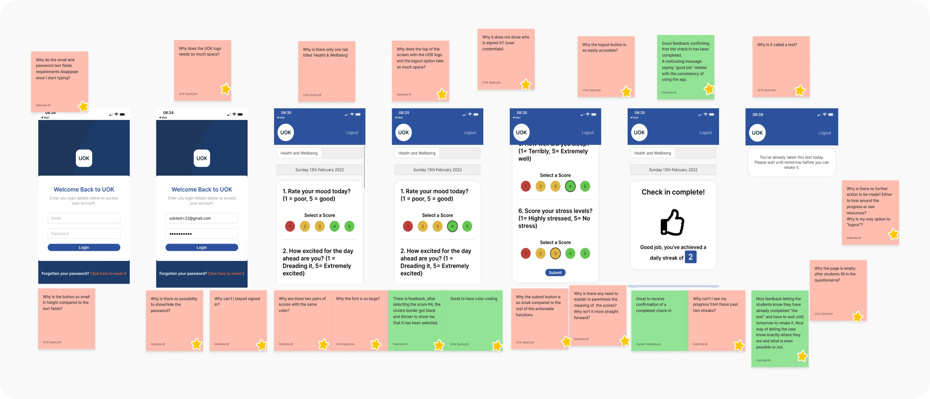
Leveraging Initial Observations and Assumptions to Guide Research and Validation
Questions & Observations
Based on our initial observations and assumptions regarding UOK, we formulated a problem statement for enhancing the overall product, subject to validation through our research.
We believe that improving the interface and adding more functions to the platform for high school students will engage them to want to share their feelings on a regular basis.
Understanding Industry Trends
Competitor Analysis
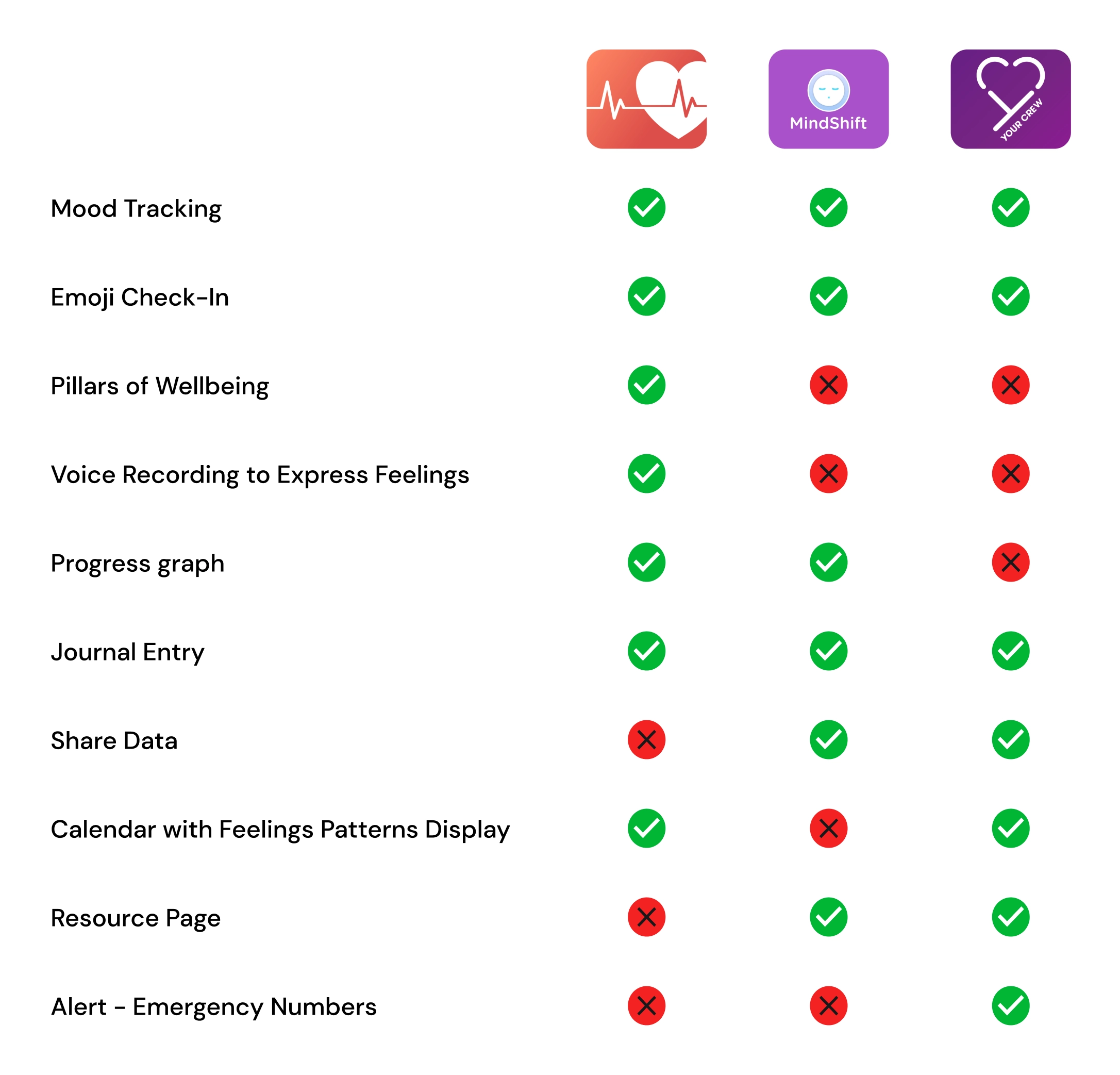
Teachers need tools that allow them to be aware of and support their student’s well-being. Apps to improve the mental health, mood tracking, and mood training of people have become a booming trend. For this reason, we carried out an analysis of the most used direct and indirect competitors to identify standards and emerging trends in the field.
Our investigation revealed a unique market positioning for UOK, as no direct competitor offered a similar service. However, we also observed how compared to the indirect competitors, UOK was behind in terms of UI and content depth.
Affinity Mapping Analysis
Understanding Student Perspectives
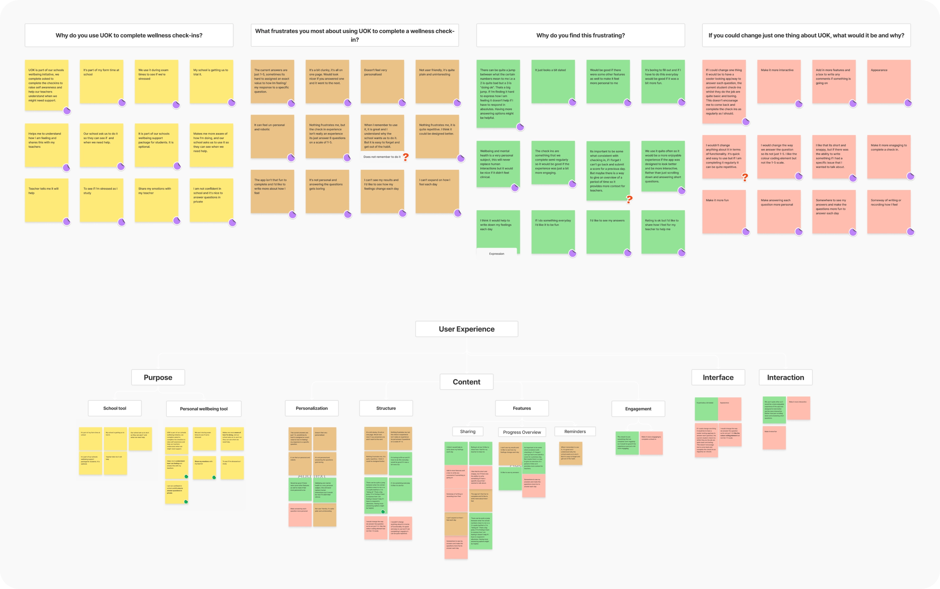
Having established our problem statement, we proceeded to synthesize data obtained from a student survey facilitated by UOK which encompassed respondents aged 12 to 18 through an Affinity Map. This allowed us to organize their insights and divide them into four categories: purpose, content, interface, and interaction.
The Affinity Map allowed us to have a clearer visualization of all the prevailing challenges. Among all the questions of the survey, we decided to focus our attention on the final four, as they were the most significant in providing feedback that related to our biggest issues.
define
After meticulously organizing the data, we pinpointed the user's primary frustrations. This helped us culminate the construction of a user story which will guide and inspire our ideation stage, providing clear direction and ensuring our solutions directly address user needs.
When interacting with the app, students are not finding the user interface enjoyable, causing them to perceive it as lacking in fun, interactivity, and overall enjoyment.
When completing the check-in, students do not find the questions sufficiently personal, leading to a sense of boredom.
Upon completing the check-in, students lack the chance to review an overview of their answers and progress, leaving them with feelings of wonder and confusion on the significance of completing the check-in.
Upon completing the check-in, students lack the chance to review an overview of their answers and progress, leaving them with feelings of wonder and confusion on the significance of completing the check-in.
User Story"As a high school student, I want to be able to freely share and learn about my emotions so I can feel heard and receive my teacher's empathy, guidance, and support throughout the school year. "
How Might We
After reading and analyzing these real user’s problems and needs, we started shaping our 'how might we' statement to guide our ideation. Through numerous iterations, our focus converged on enhancing the app's appeal by adding elements of enjoyment, and personalization, reducing monotony, and fostering greater interactivity, including the ability to share and track daily progress. The word that best fit our purposes was “engagement” and our 'how might we' question emerged as follows:
How might we make the daily check-in experience more engaging for students?
IDEATE
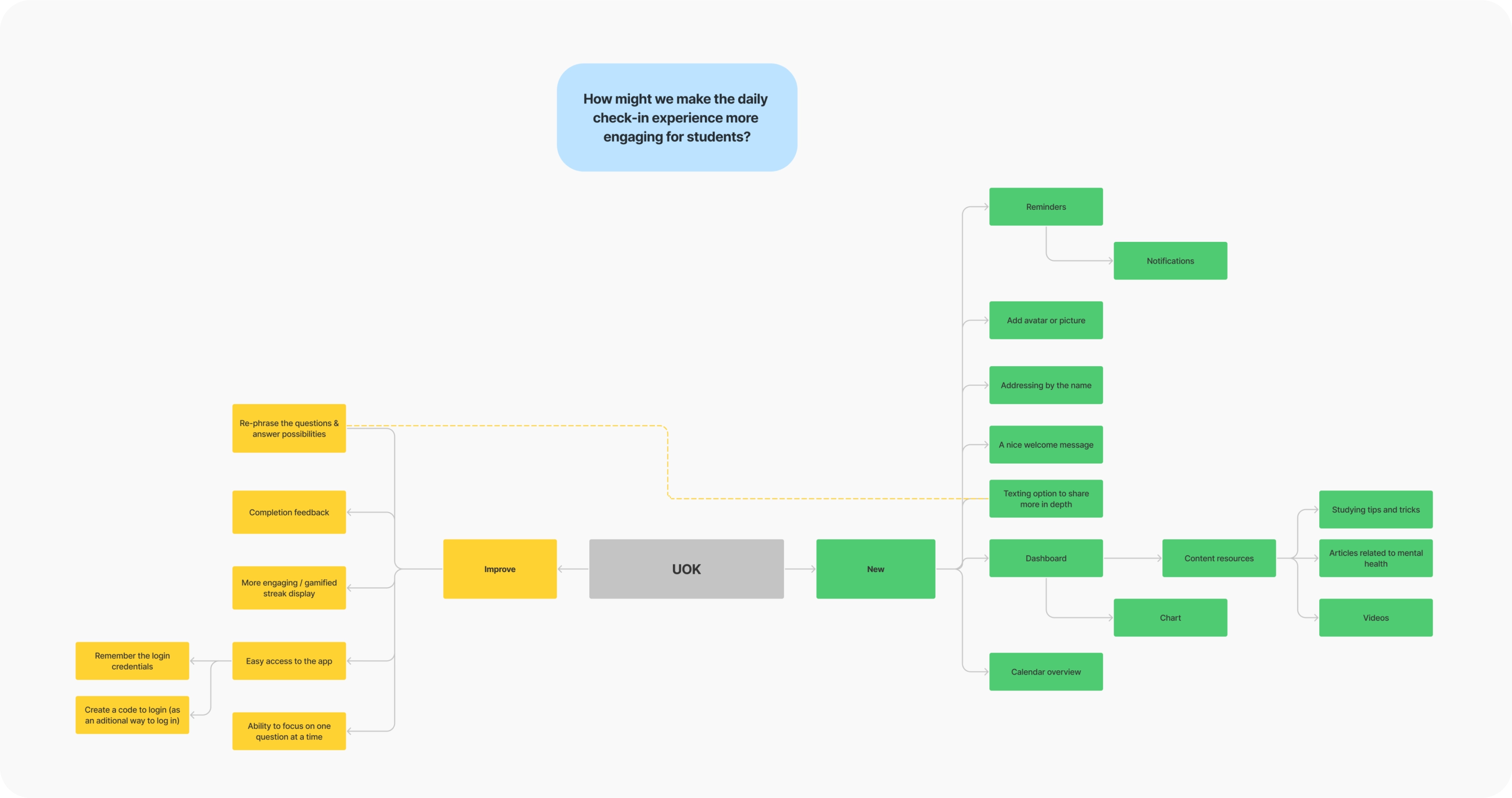
Guided by our ‘how might we’, we completed a mind mapping exercise to help us decide what can be improved and added to the existing UOK check-in experience. After careful consideration of our research findings and project timeline, we made the strategic decision to prioritize enhancing current features over introducing new ones.
Some of the ideas that emerged from this exercise were: a warm personalized welcome message, integrating a texting option for more in-depth sharing, refining question phrasing for clarity, and implementing a dynamic progress dashboard for students to follow their day-to-day progress.
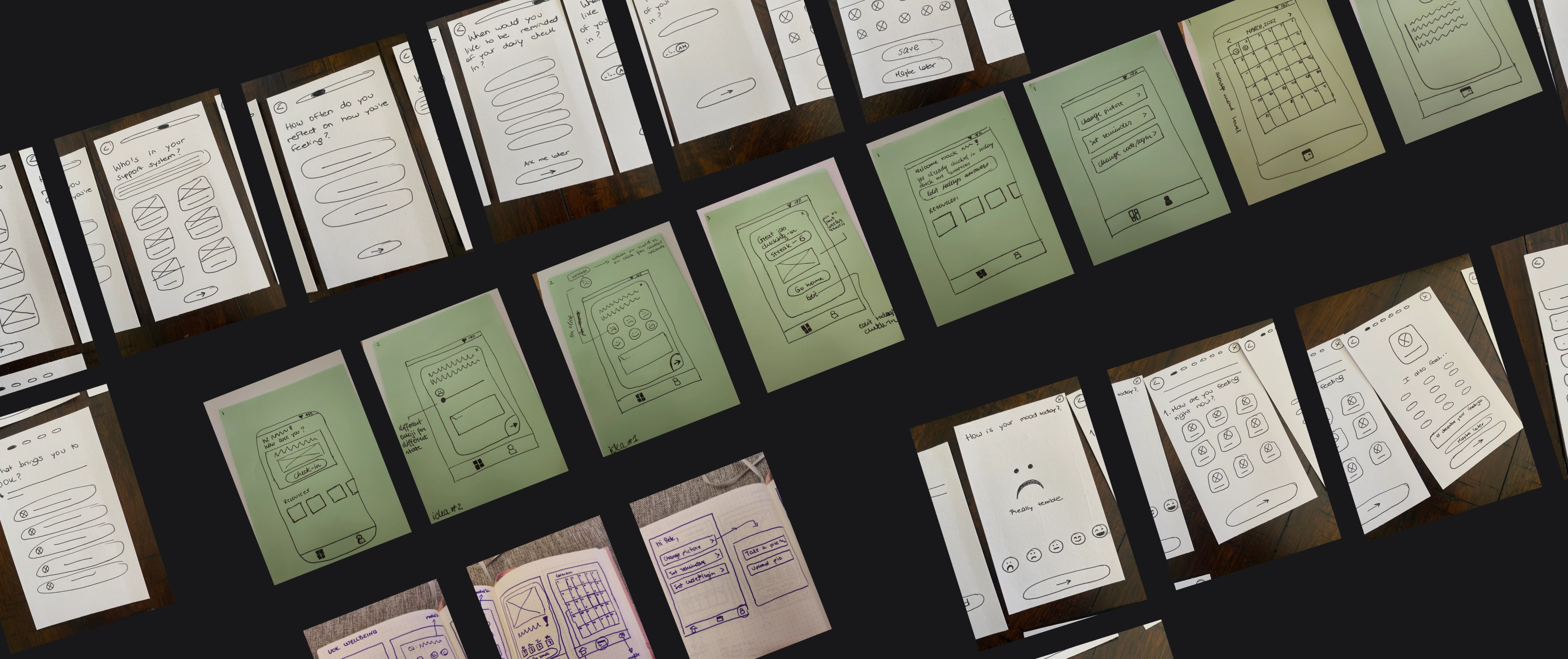
Considering the potential enhancements and new features identified during the mind mapping session, we transitioned to the sketching phase to provide visual representations of their implementation within the design framework.
At the same time, we conducted a brainstorming session to refine the questions for the check-in process. Through collaborative efforts, we tailored the original questions to resonate more intimately with high school students, giving them a personalized touch to enhance engagement and relevance.
Competitor Benchmarking & SWOT Analysis
Exploring Various Check-In Models
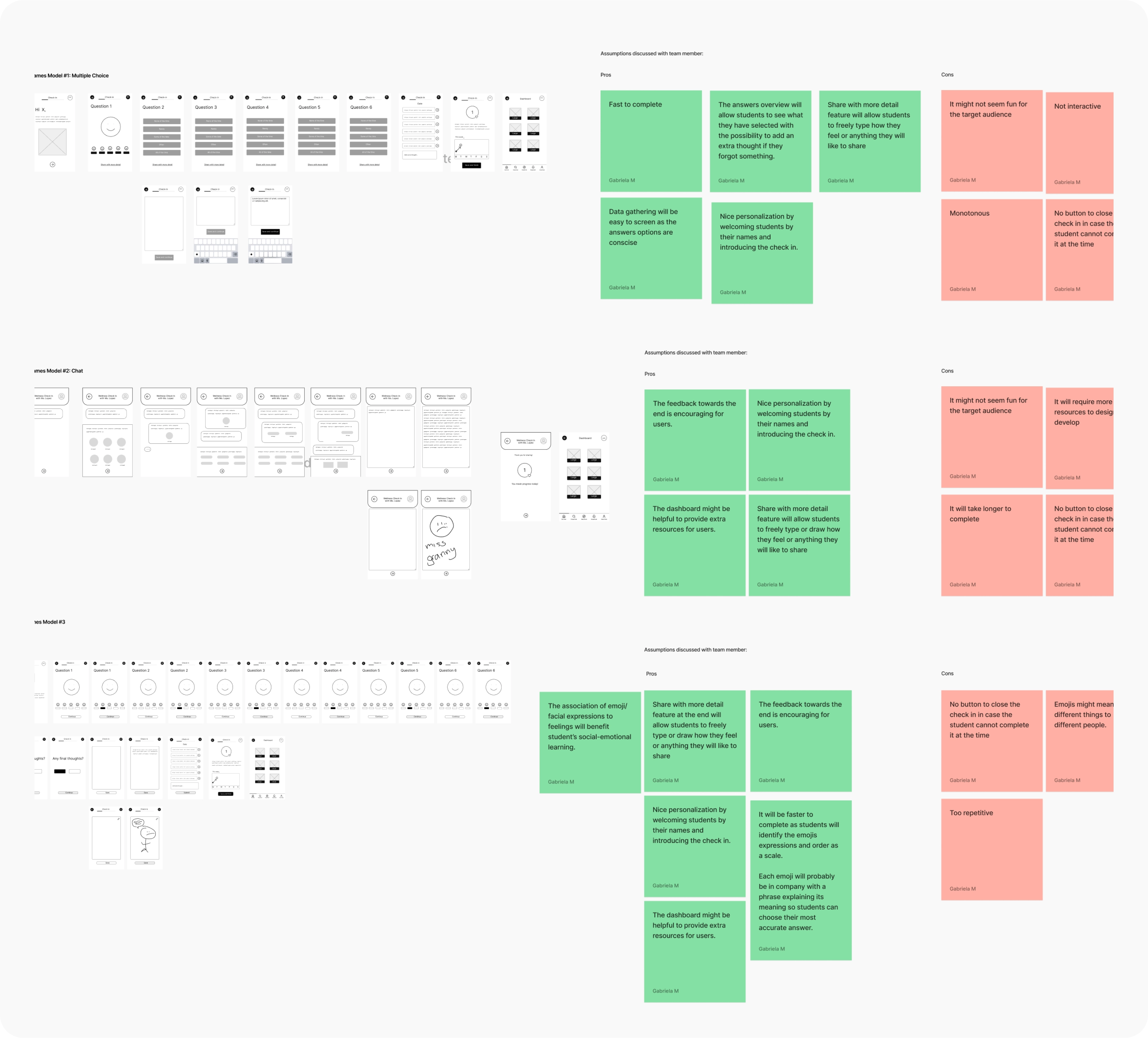
After finalizing our potentially improved user flow, we decided to start wireframing. We explored different models for the check-in process: questions with pre-written answers, a chat interface, and an emoji selection check-in.
Following experimentation with these three models and weighing their respective pros and cons, we concluded that the emoji selection check-in was the most suitable option. Our decision was informed by research indicating the potential benefits of this interface type. It's evident that emojis have long played a significant role in the classroom environment, with teachers utilizing them as tools for social-emotional learning.
Here are some of the benefits we uncovered regarding the use of emojis as visual representations of emotions:
Emojis provide a means for students who may struggle to express their feelings verbally to communicate effectively, bridging the gap between emotions and words.
As graphic and visual representations of thoughts and feelings, emojis cater to visual learners, enhancing comprehension and engagement with emotional expression.
Emojis offer a tool to alleviate the discomfort often associated with discussing sensitive topics or emotions. They serve to soften potentially awkward moments or messages, making it easier for students to engage in conversations about their feelings and well-being.
Posted in: [Coaching](https://byronernest.blog/category/coaching/) by Dr. Byron L. Ernest on December 12, 2016
PROTOTYPE
Integrating Student’s Feedback and New Features to Enhance User Flows
Elevating Student Engagement: Evolving the Check-In Experience
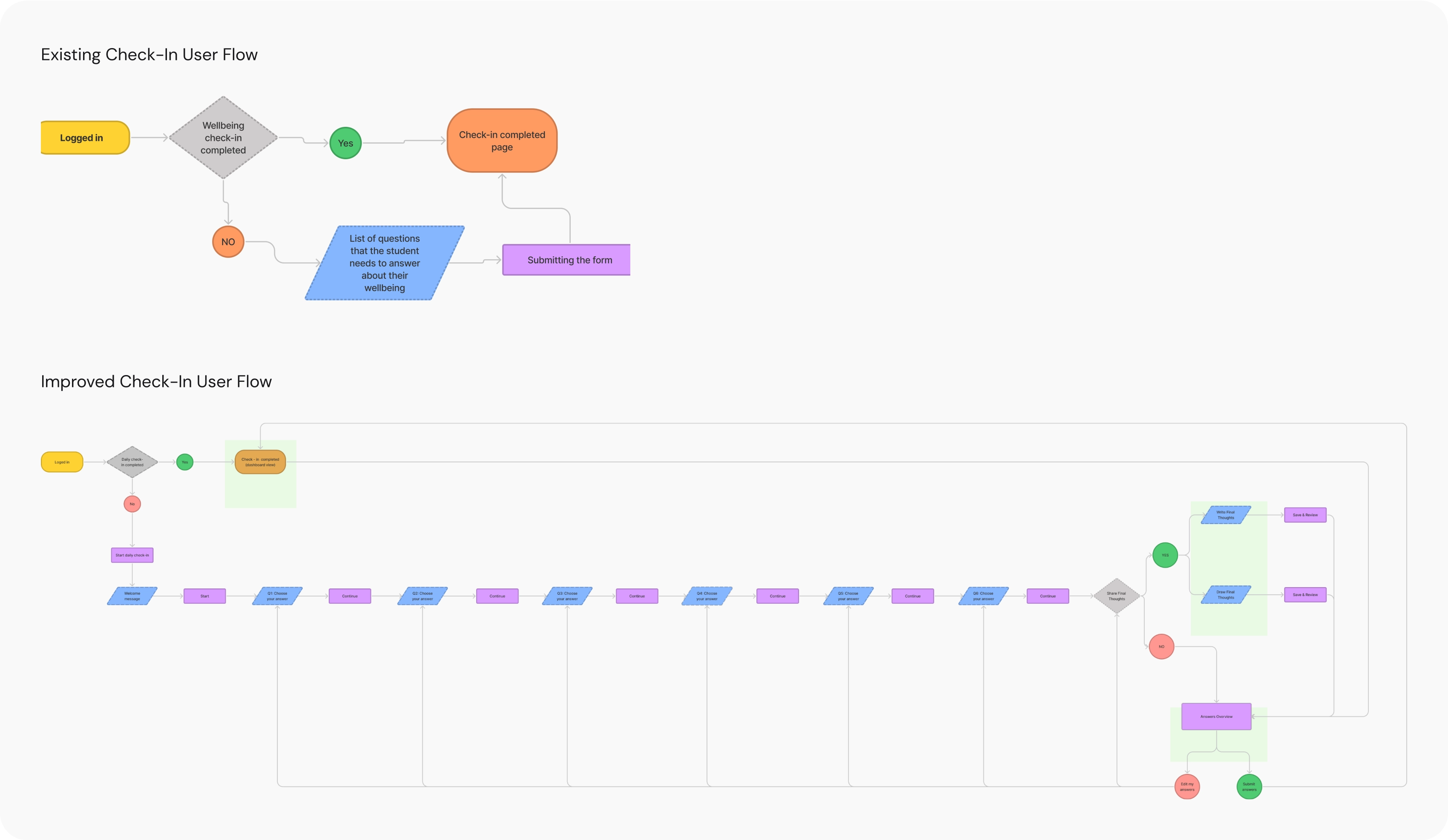
We utilized our previously outlined user story and a new check-in model to refine the existing user flow, with a primary focus on enriching the check-in experience. Drawing from insights gathered in our mind mapping exercises, our aim was to boost and sustain student engagement. Key enhancements resulting from this effort include introducing a 'final thoughts' section where students can freely express themselves through text or drawings, an answers overview for enhanced clarity, and a comprehensive dashboard that provides insights into progress and facilitates easy access to valuable resources.
Addition of a Final Thoughts Entry
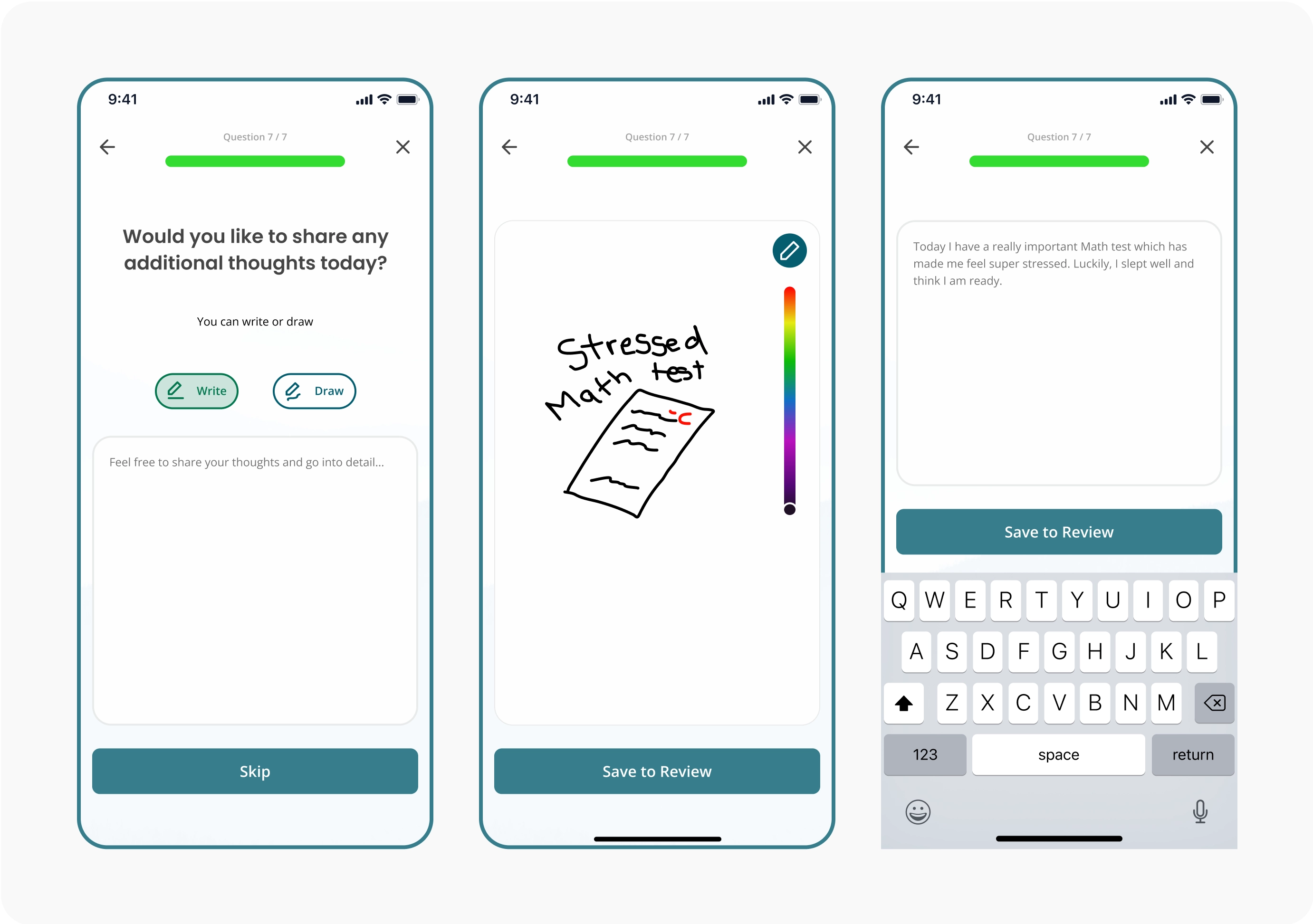
Encouraging students to express their emotions through typing or drawing.
Answers Overview
Students can now review and edit their responses before submission.
Dashboard of Progress and Resources + Insights Screen
Students can access a personalized dashboard featuring resources and an Insights Screen, providing a visual representation of their daily submission calendar and emotional trends.
DESIGN
UOK Design System
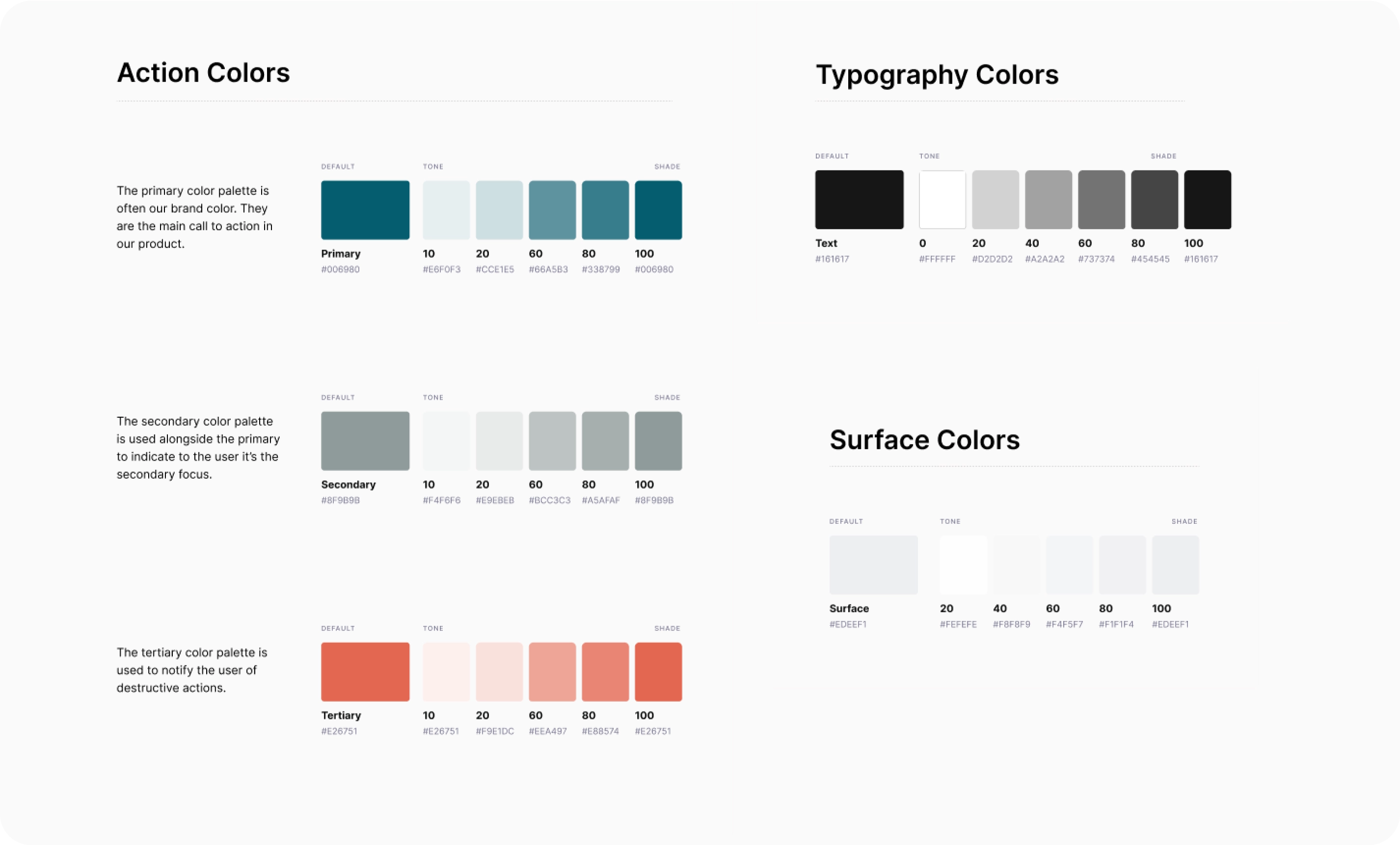
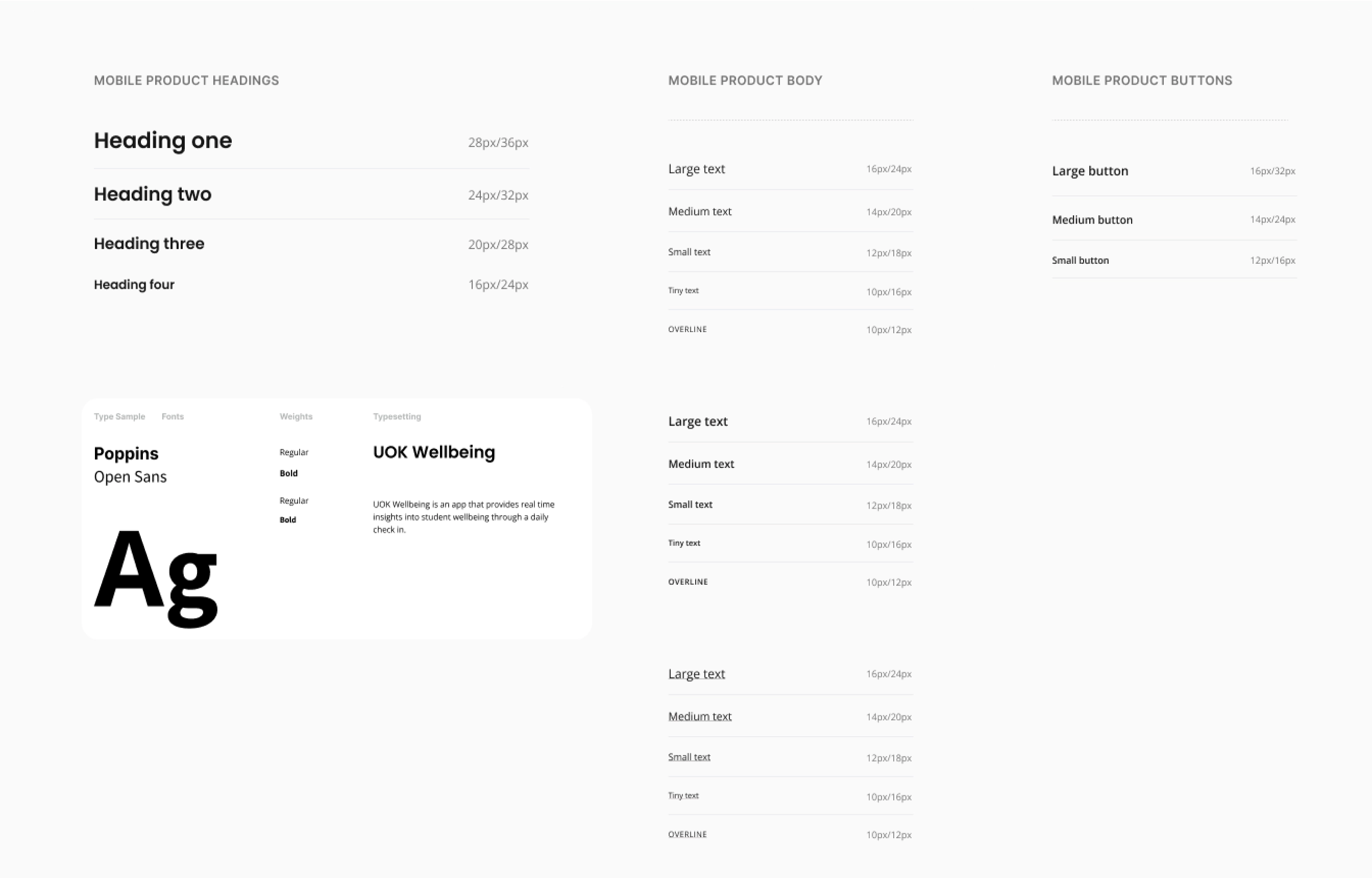
Upon selecting which wireframe type we were going to move forward with, we selected the product's stylistic elements, adhering to the 8-point rule to guarantee a coherent design aesthetic. While navigating this process, we ensured strict adherence to the UOK brand color guidelines. Anticipating the prototype creation phase, we strategically defined styles and components to assist the design process while maintaining a commitment to consistency and precision.
FINAL SCREENS
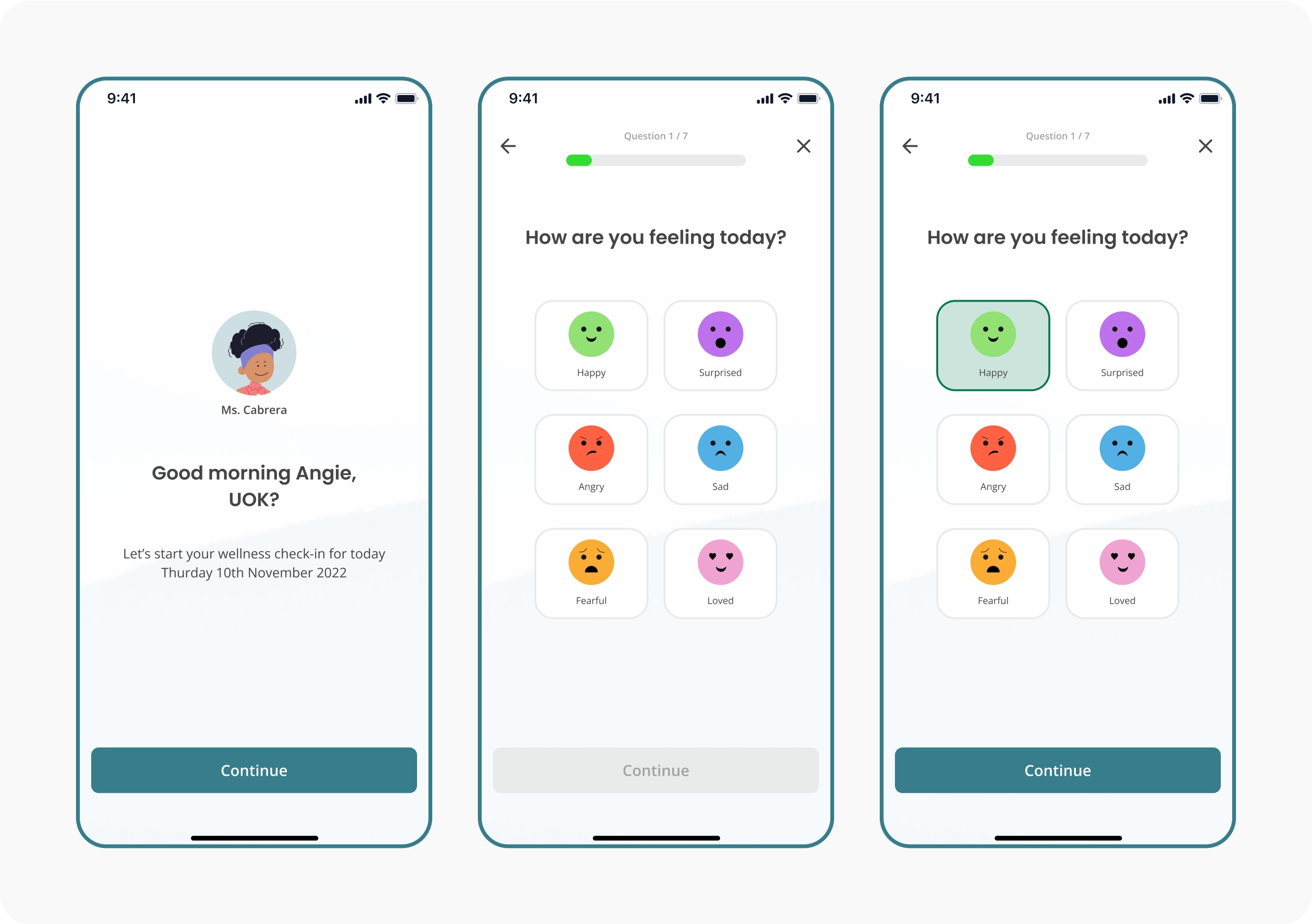
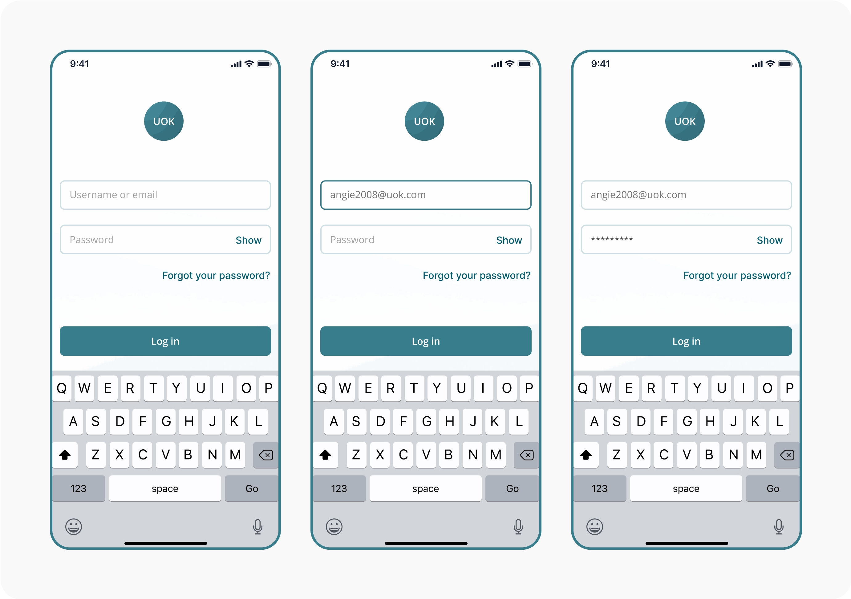
Easy Onboarding
The UOK app offers a seamless onboarding experience, guiding you effortlessly through the log in.
Engaging Emoji Check-In
Effortlessly express how you feel with a tap. Choose from a range of emojis to share your current emotional state. It's a quick and engaging way for students to communicate their feelings
Free Expression Journal and Drawing Canvas
Designed to empower students in sharing their thoughts, emotions, and creative expressions, this feature offers a safe and nurturing space within our app. Whether through written entries or artistic creations, students can freely express themselves, fostering self-awareness and emotional articulation.
INTERACTIVE PROTOTYPE
TESTING
Once we had finalized the prototype, we developed a testing script along with a scenario to validate it with real users. To facilitate this process, we utilized Maze and collected feedback during the test, focusing on a typical daily check-in scenario.
However, the free version of the Maze Testing app came with some limitations, which impacted the test results. Due to time constraints, we couldn't make the prototype fully clickable in terms of responses. Our main objective was to evaluate how engaging users found the app's layout and the style of questions and answers.
We had 17 participants in total.
- All testers (100%) reported that completing the check-in on UOK was easy.
- 86% of testers expressed that incorporating a journal and canvas towards the end of the check-in would be beneficial.
- 72.73% of testers successfully completed the usability task.
Iterations
Following our user testing, we implemented several iterations. Primarily, we transitioned the questions to a "how format" based on user feedback. Users tended to interpret emojis not only as expressions of feeling but also as indicators of a scale. Hence, this question format was expected to streamline their responses.
Additionally, users offered valuable insights regarding the color scheme. Notably, the happy emoji in the first question was yellow, while the highest content level in the scale was represented by green. Users suggested using distinct colors for these emojis, as they conveyed different expressions despite sharing the same color.
RETROSPECTIVE
While the majority of testers (72.73%) successfully completed the task, most did so through an "unexpected route", as noted by the Maze Test analysis. Users attributed this deviation to the prototype's lack of full clickability. Future iterations may prioritize making prototypes fully clickable to enhance test accuracy and minimize user frustration during testing.
Looking ahead, there's potential for further enhancements, particularly in refining the dashboard and prototyping the resources feature. Additionally, exploring the teacher's perspective of the app could offer valuable insights for future development.
This case study underscores how our iteration of UOK, which involved enhancing the UI to be more user-friendly and age-appropriate, integrating additional features like journal and canvas functionalities, and providing an overview of results, contributed to improved engagement and overall user experience. It encourages students to share their feelings regularly with UOK.
The goal of this project was to encourage students to share their emotions with their teachers regularly with UOK. Enhancements such as refining the UI to be more intuitive and suitable for their age group, incorporating features like journaling and canvas functionalities, and offering an overview of their submissions are expected to enhance engagement and improve the overall user experience. However, further validation through testing with users within the target demographics is essential to confirm these improvements.