NYC Borough Pass
ROLE / SERVICES
User Research and Design
TYPE
Tourism Website
LOCATION
NYC, USA
MY ROLE
UX Researcher
UI Designer
TEAM
Amauche Uzoigwe
(UX/UI Designer)
TOOLS
Figma
Miro
Jira
Notion
TIMELINE
Oct 2023 - Mar 2024
CLIENT
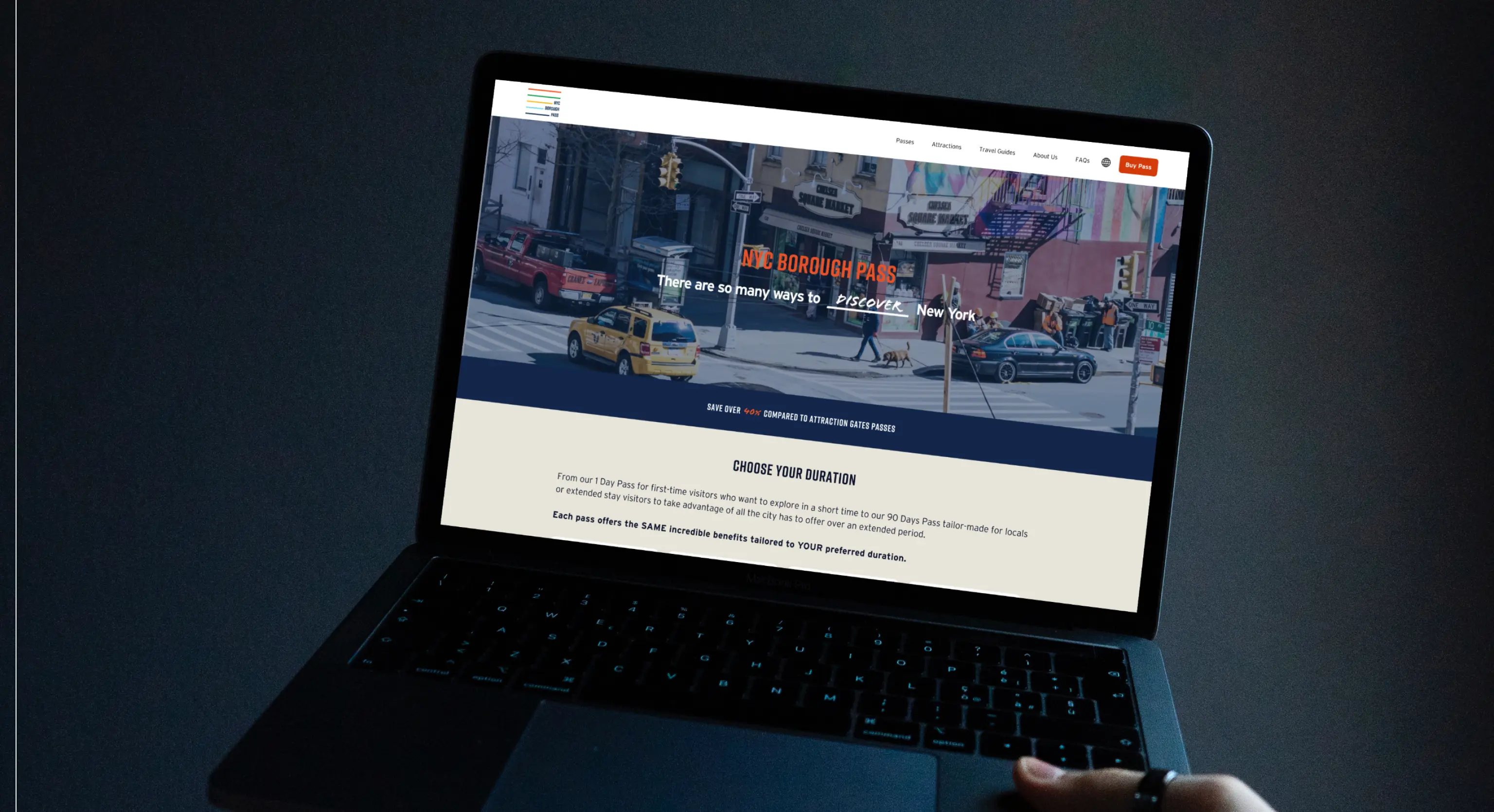
NYC Borough Pass is an e-commerce website that offers passes designed to reveal the real New York City, where each borough has a unique story to tell, allowing travelers and locals to easily explore the diverse cultural, historical, entertainment experiences across the city.
PROJECT OVERVIEW
As New York City Borough Pass (NYCBP) approached a re-launch of its services, the need for a new website became apparent. This case study explores the process of designing a website tailored to attract both travelers and locals. With a focus on seamless operation, clear mission communication, and straightforward access to experiences and pass purchases, the website aimed to meet the diverse needs of its users. This case study showcases the progression from research to enhancing primary flows, ensuring responsiveness, and design integration into Webflow.
PROBLEM STATEMENT
The current website for NYCBP lacks intuitive navigation and fails to effectively communicate the value proposition of their passes, resulting in low customer engagement and limited sales conversion. There is a clear need to redesign the website from end to end to enhance user experience, generate interest among potential customers, and ultimately drive higher pass sales.
SOLUTION
We created a new end-to-end responsive website for NYCBP with a focus on clear communication and display of its passes and benefits, intuitive navigation, engaging visuals, and interactive features to motivate users’ interest in discovering the unique experiences offered by NYCBP and encourage them to make a purchase.
PROCESS
Throughout this project, the Design Team followed the Design Thinking Methodology alongside Agile practices. We integrated daily stand-up meetings, sprints, and retrospectives to orchestrate our process and ensure seamless alignment with the wider team.
Our approach wasn't linear; it was dynamic and iterative. We encountered numerous insights and pivots along the way, which kept us with a spirit of continuous learning and adaptation.
Here's a glimpse into our journey:
empathize
Exploration
What are the pain points of the current experience?
Our journey to explore NYC Borough Pass began with a comprehensive UX audit of the existing state of their website. This first step helped us uncover more about the brand, its services and particularly, the significant pain points in the experience they wanted to address. These were some of our main findings:
Inconsistent Visual Hierarchy
Inconsistent use of color scheme, typography and whitespace, which caused confusion in prioritizing content and navigation elements.
Misalignment with Brand Identity
Unalignment with new NYCBP brand guidelines which affected brand consistency and recognition.
Lack of engaging components
The lack of multimedia elements and interactive features affected user engagement.
Unclear Information Architecture
The organization of the content and navigation paths were unclear, making it difficult for user to locate the main services and navigate the site effectively.
Limited Filtering and Sorting Options
Lack of filters or sorting options, which made it challenging for users to discover experiences that matched their specific needs and preferences.
AVERAGE ENGAGEMENT TIME
42s
DROP-OFF RATE FROM HOMEPAGE TO ATTRACTION PAGE
93%
Competitive Research
Who are NYCBP competitors?
What can we learn from them?
During our competitive benchmarking, we discovered and analyzed three direct competitors of NYCBP. This allowed us to gain insights into industry trends, features and potential areas for differentiation to inform our designs.
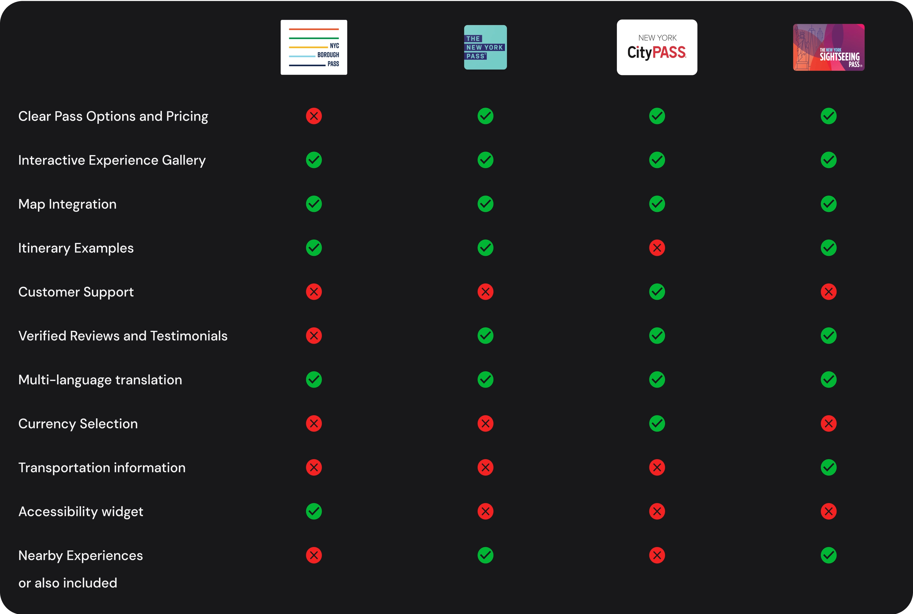
Table comparing popular features of competitors
Through this competitor benchmarking, we discovered that NYCBP has a unique market opportunity, as we found that most of the competitors offer the same kind of experiences and attractions.
NYCBP offers unique experiences and has deep ties with the NYC community, which gives them the potential to resonate not only with tourists but also with locals. This key differentiator is something we agreed to emphasize in the design.
define
Feature Analysis and Prioritization
Which features could potentially be incorporated into NYCBP?
Following a detailed analysis of our competitor’s solutions and based on our understanding of the user needs and business requirements of NYCBP. We started a collaborative effort to pinpoint areas for improvement. Working closely with the product and development teams, we assessed the viability of our proposed enhancements.
The outcome?
A thoughtfully list of upgrades and new features planned to elevate NYCBP’s performance and user experience, strategically aligned with our objectives.
- Implementation of a consistent design system
- Clear presentation of reservation requirements
- Inclusion of a “Passes Page”
- Emphasis on original prices to highlight savings
- Expansion of the map feature
- Enhancement of the 'About Us' page to emphasize NYCBP’s social impact
- Expanding the range of filters
- Addressing footer responsiveness
- Introduction of a main checkout card
Our discussion allowed us to collaboratively prepare a list of inquiries for the client, covering aspects such as their target demographic, access to Google Analytics data, past user feedback or reviews, intricate details about the passes and their financial model for savings calculation, and additional insights regarding the Bandwangoo integration.
Constraints
Understanding our primary constraint
From the responses we received, we determined that the primary constraint for this project would be the Bandwangoo integration. Bandwangoo serves as the destination experience engine integration utilized by NYCBP. They oversee the management of the purchase flow and offer technical customer support.
Given the client's feedback highlighting very limited access to Bandwangoo's code, we strategically chose to design our solution around this integration.
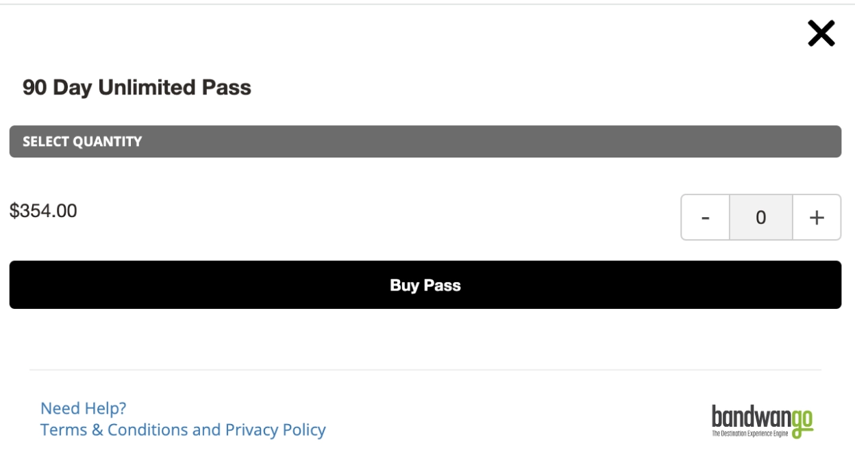
Bandwangoo Integration Purchase Pop Up
ideate
User Flows
How can we streamline user understanding and navigation of the passes?
Optimization of User Flows
Before jumping into designing, we needed to improve how users learn about the passes and purchase process as well as the discovery and filter of their experiences. For this, we created two main user stories with two different end goals which helped us refine the steps each user had to take to achieve the respective objectives. Our purpose was to reduce friction and improve the navigation.
User Story #1:
User wants to learn about the passes available through NYC Borough Pass
Previous User Flow

New User Flow
We streamlined passes discoverability by creating a “passes page” and also enhance the purchase flow by including a purchase card within that same page.

User Story #2:
User already have their NYC Borough Pass and want to discover the experiences in Manhattan covered with it.
Previous User Flow

New User Flow
We facilitated the discoverability of the experiences organically through the passes page and expanded filtering possibilities to better match user’s preferences.

IA Refinement
Structuring pages by hierarchy
During our audit, we pinpointed the lack of clarity in the information architecture of the site, which resulted in confusion during navigation.
Our first step to address this challenge involved structuring the website pages by a clear hierarchy, distinguishing between primary, supporting, and utilitarian pages. This organization enables us to prioritize content and guide user engagement effectively.
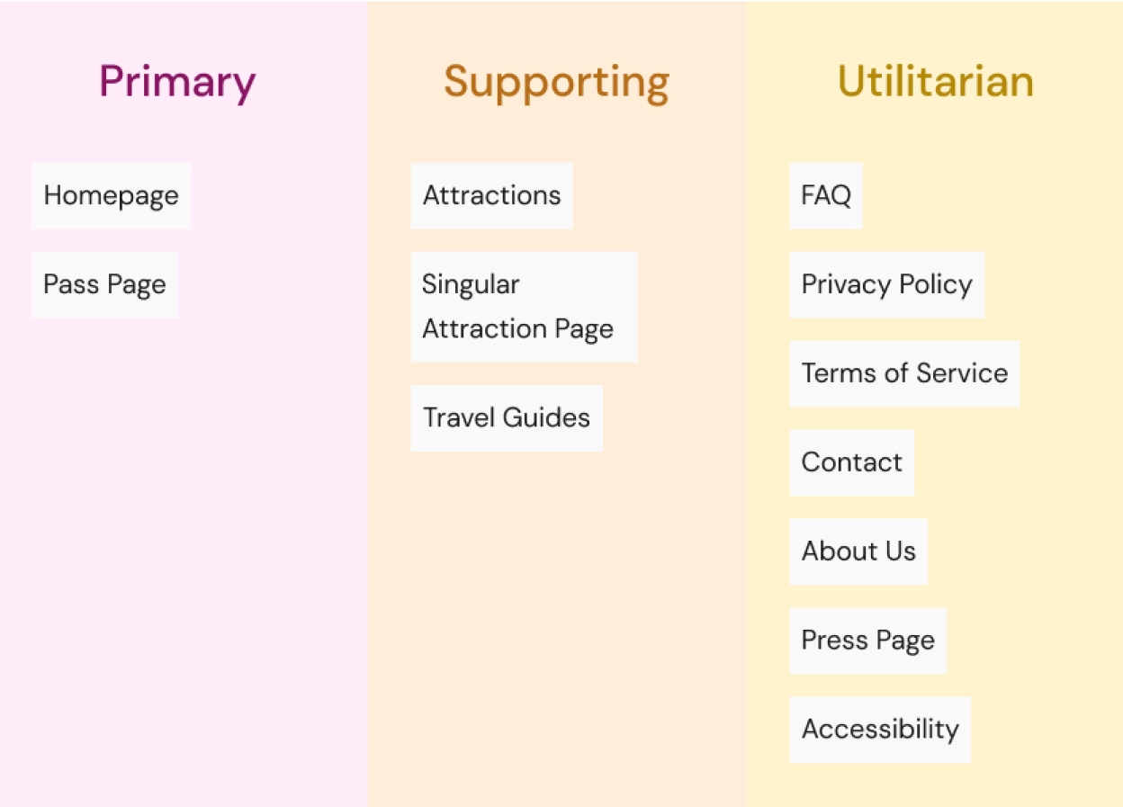
Pages Hierarchy
Collaboration with Stakeholders
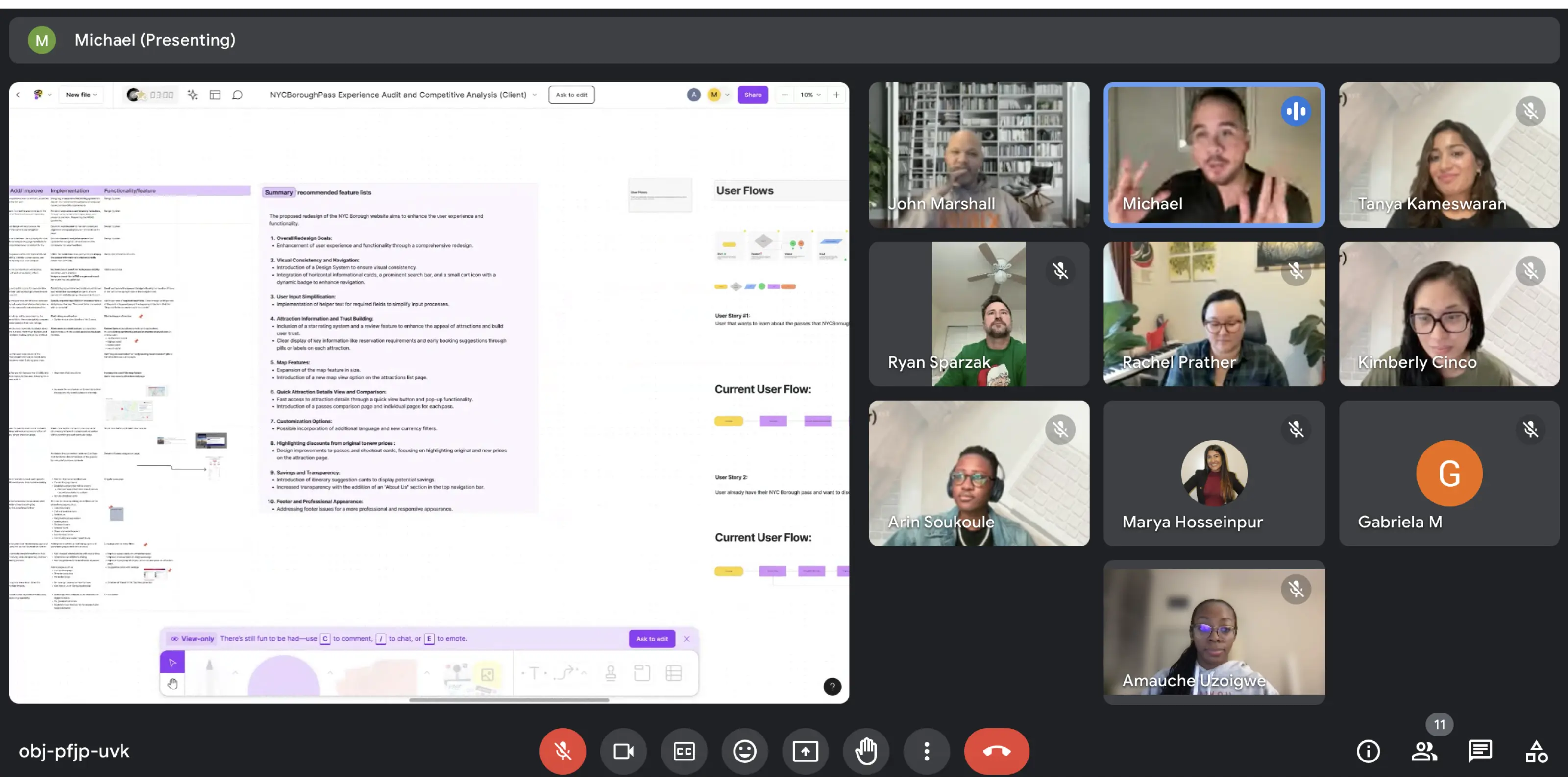
Stakeholder Engagement
Following the organization of the page hierarchy and planning of our project’s direction for the NYCBP website, our team met with the stakeholders. We presented our research findings, recommended features, and streamlined user flows. The stakeholders praised the depth of our research and the clarity of our proposals, which reinforced the general confidence of the team in the project’s direction.
One outcome of the meeting was the decision to design and develop the review feature but delay its launch until the company gathers a substantial number of client reviews. This strategic choice ensured that when the feature goes live, it will offer genuine value to users from the start.
Ideation
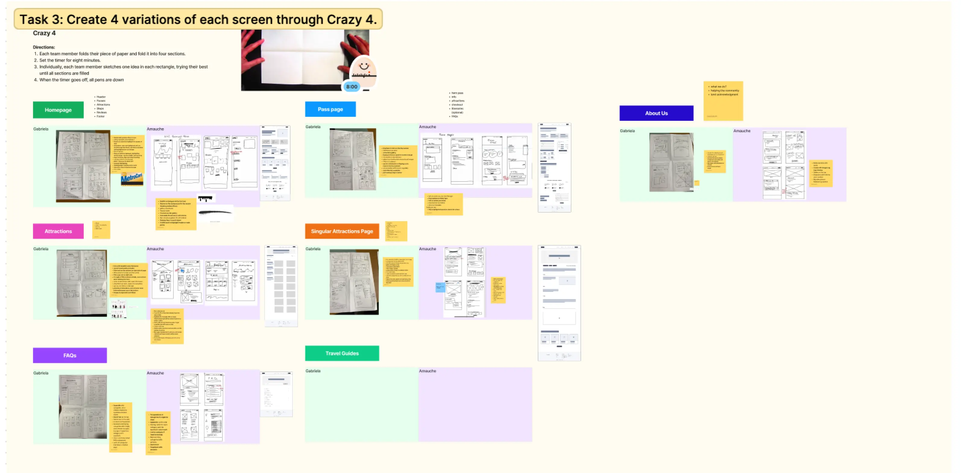
Variations over versions
After finalizing the pages we intended to design and organizing our approach, we started ideatiating. We completed several variations of each page to challenge us as designers to think outside the box. This is something that was recommended by our Lead Miguel, who encourage us to be creative and think about exploring different solutions to a problem rather than simply varying how we presented the same content.
This was followed by a feedback session with the rest of the team to vote on and select the most promising ideas.
prototype
Cross-functional Collaboration
Alignment between design and development
After refining our low-fi wireframes through multiple iterations and integrating valuable feedback from our team, we successfully defined our Minimum Viable Product (MVP) and progressed to crafting high-fidelity mockups. This phase involved utilizing NYCBP new brand guidelines, selecting brand colors, typography, and imagery to create an attractive and engaging design.
With the high-fidelity designs finalized, we amplify our collaboration with the development team by providing them with crucial assets and detailed notes to ensure a seamless transition into the development phase.

Design Solutions
High Fidelity Mockups
Capturing NYCBP Essence
The homepage of NYCBP now has a clear horizontal display of passes for easy comparison, alongside an engaging carousel of attractions. We've streamlined the pass acquisition process with an interactive 3-step guide. Plus, visitors can now easily grasp the company's core values through a highlighted section. These improvements ensure a more intuitive, captivating, and informative browsing experience.

An Intuitive Purchase Flow
To simplify the buying experience of the passes and improve conversion we incorporated a scalable checkout card on the Passes Page that aligned with the Bandwangoo integration to ensure a seamless selection and transaction experience of the passes. This checkout card also shares the validity information dynamically depending on the pass.

Streamlined Customization
Enhanced the experience previews to provide comprehensive information and tags, while integrating a wider array of filters, making it easier to search based on your preferences, interests, and accessibility needs.

Optimize Information Architecture & Enhance Key Features
We added an interactive gallery of images, accompanied by informative tags. Cleared the information architecture of each experience, this information was structured intensionally to provide all the details needed for the users to enjoy the attraction easily and smoothly. We also increase the size of the map feature to facilitate exploration and added a “nearby experiences” section to invite users to continue their journey with NYCBP.

Establishing Trust, Share Story
Based on our research, we discovered that many users are drawn to NYCBP over its competitors because they value supporting local businesses that actively contribute to the NYC community. With this insight in mind, we crafted an immersive "About Us" page, centered on the essence of NYCBP – the who, what and why. Our goal is to establish genuine connections with users by showcasing the heart and soul of our brand

test
Design Improvements
How could we gauge the success of the design?
During the beginning of the development phase we opted to conduct usability testing across both mobile and desktop platforms, utilizing a representative sample of 5 users reflecting the demographics of NYCBP's user base.
- We created two high fidelity interactive prototypes one for mobile and one for desktop using the seven task flows.
- We held 5 moderated, remote usability tests.
Success Metrics
- Ease of Use
- # Errors
- Overall User Experience (What could be improved?)
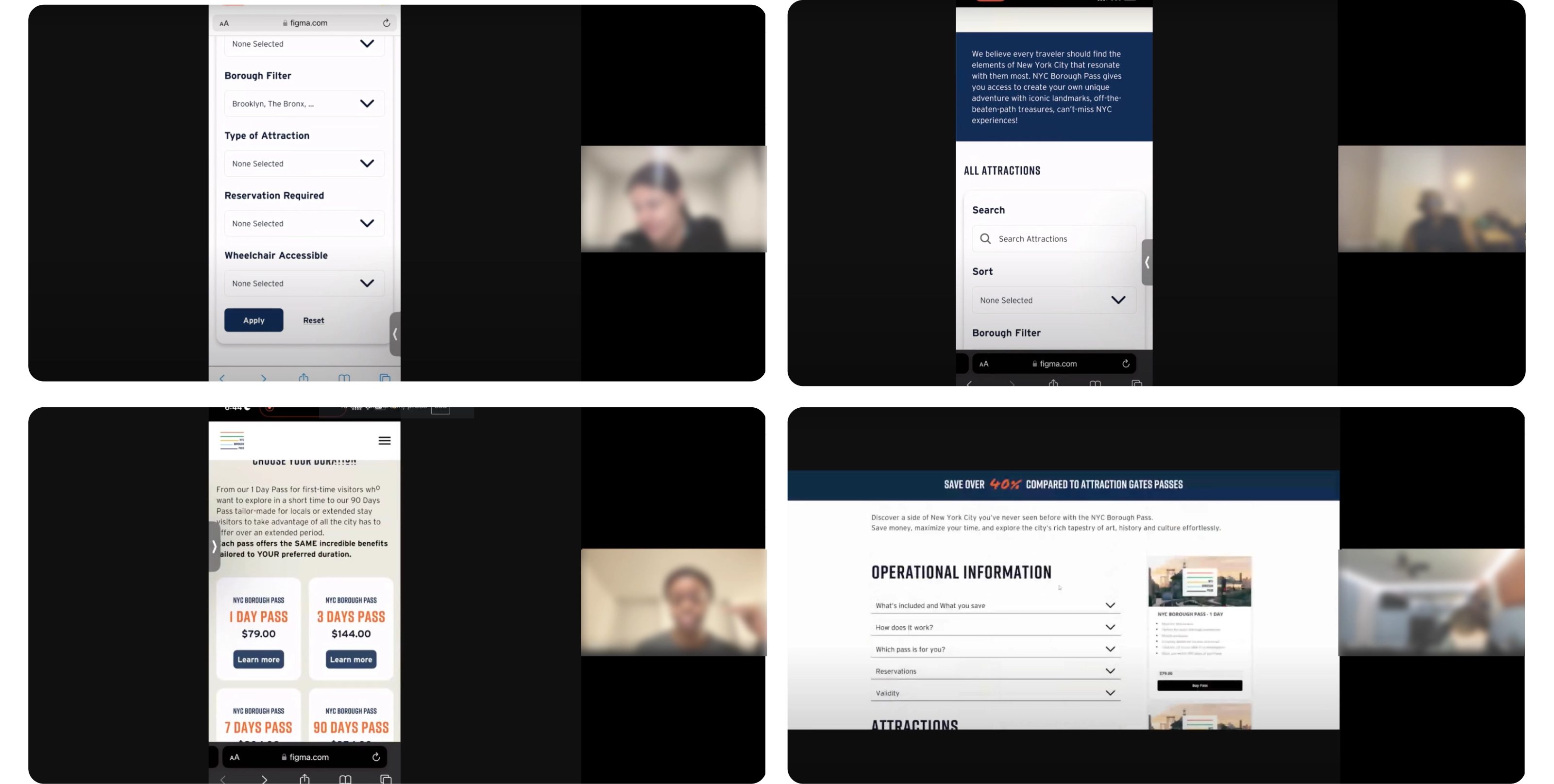
Following this, we transcribed and coded the interviews, subsequently clustering the key points to derive insights and pain points. We were able to uncover a couple of recurring issues among users, primarily revolving around information restructuring and key navigational elements.
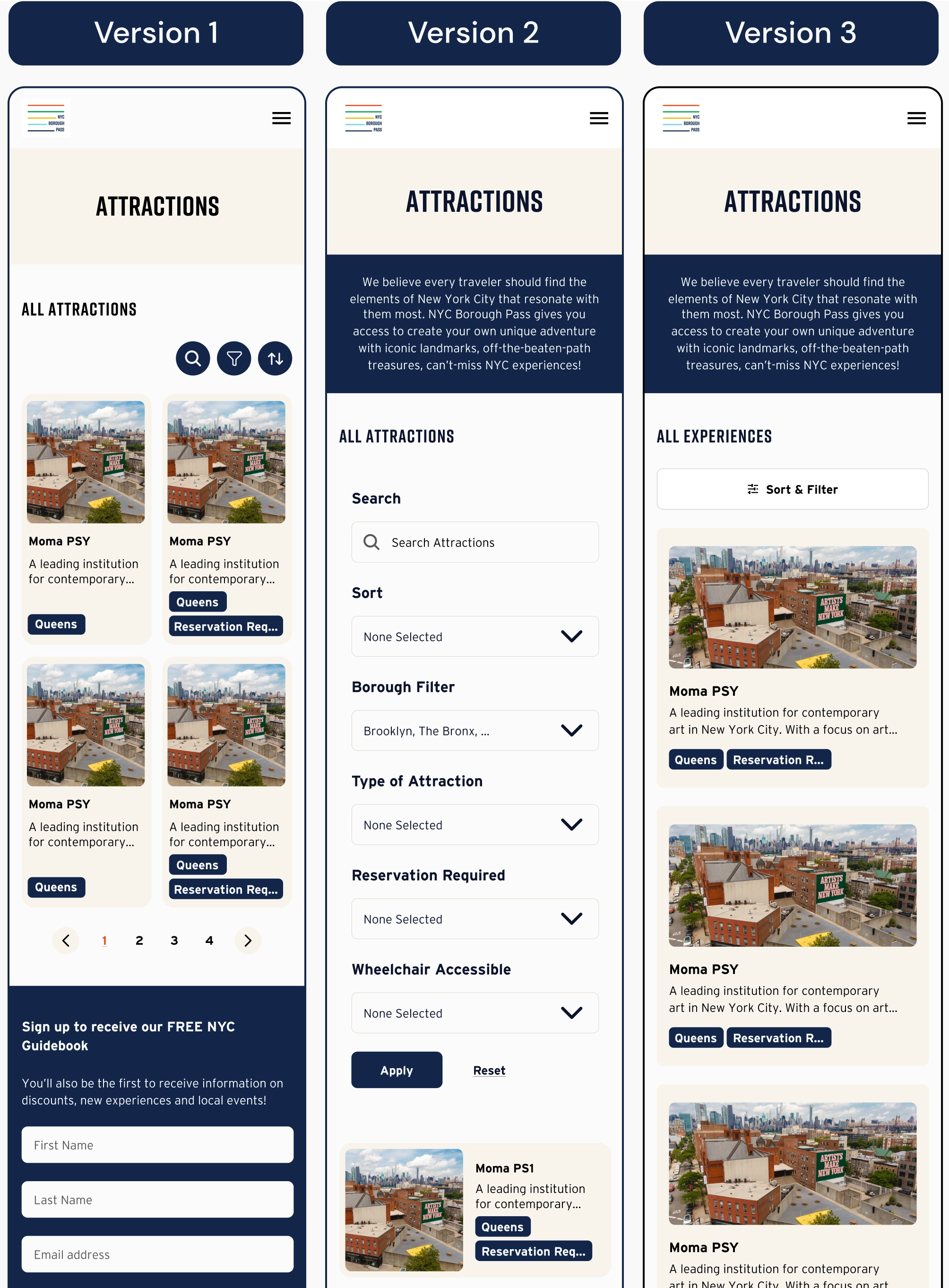
Upon identifying the areas for improvement, we provided the iterative solutions to our development team. The following slides showcase of the before-and-after transformations of the filters feature of the “Experiences Page”.
Iterations After Testing: Sort and Filter Button
During our mobile testing, we encountered a recurring issue concerning the utilization of filters within the "Experiences Page," formerly known as the "Attractions Page." Users seemed to overlook the attractions displayed below and instead immediately engaged with the filters, treating them as mandatory tools for finding attractions rather than optional aids for refining preferences. To address this, we undertook three iterations.
In the second version displayed, users expressed confusion when the search and filter options were automatically opened, obscuring the fact that they were filtering results further down the page.
Our final iteration, version 3, resolved this by allowing users to easily show/hide the sort and filter buttons, while also emphasizing the presence of experience cards within the interface.
The end
Learnings
Planning for the Future...
One iteration that was left ready for future implementation but not yet integrated into the product was the reviews section. Our initial research highlighted the critical role this feature plays in establishing user trust in the services we offer. Although NYCBP lacked any reviews at the time, they were actively planning an email strategy to procure them. While the section was fully designed and developed, it remained hidden on Webflow until the business acquired the necessary reviews.
Future analysis of the Analytics of the website will be required to guarantee we improved the average engagement time and drop-off rate from the homepage to the attraction page showed at the beginning of this case study.
My biggest challenge was...
My biggest challenge was working cross-functionally to ensure thorough alignment of the development, which relied on integrating multiple layers of technology, including Webflow's technical capabilities and third-party technology (Bandwangoo). When designing, we were not only focusing on a single web platform or an isolated feature. We were designing for integration. Our approach encompassed not only meeting user needs but also the careful consideration of technical capabilities, which was crucial to our success. Working cross-functionally proved to be a challenge, not in that we needed help getting alignment; it was just the part of the process that demanded more care and attention. We navigated this challenge successfully and achieved alignment through different ceremonies, such as our weekly XFN meetings, inner team meetings, collaboration meetings between Design, Development, and Product Apprentices, and finally client review meetings at the end of each sprint. While it has always been important for me to work in alignment with engineering, This project also made me very excited about not only encouraging early collaboration with engineers on future projects but also deepening my understanding of diverse platforms and technologies and the impact of third-party integrations on final design outcomes.
My biggest learning were...
Constant communication and cross functional alignment is key for a successful project. Establishing clear expectations and priorities from the outset significantly streamlines the project's progress. Keeping stakeholders informed, fostering trust, and promptly following up are essential practices. Additionally, Notion (or a simple notebook) could truly be your best friend.
I would like to conclude this case study by expressing my heartfelt gratitude to the Rita XYZ team and my fellow apprentices Amauche, Rachel, Cass, Ella and Hoss for creating a safe space for us to grow, filled with motivation, empathy and support.