Unplugged
ROLE / SERVICES
User Research and Design
TYPE
Booking Website
LOCATION
London, UK

MY ROLE
UX Researcher
UI Designer
TEAM
Fellow UX Designer Aditya
TOOLS
Figma
Miro
Slack
Maze
TIMELINE
5 weeks
CLIENT
Unplugged is a booking website trying to provide off grid - digital detox cabins near UK's biggest cities for busy city workers to disconnect from technology and recharge with nature.
PROJECT OVERVIEW
Redesigning the Unplugged booking website's search and selection features aimed at efficiently filtering results to match to the needs of busy city workers in finding their perfect cabin. Our high level objectives included enhancing customer satisfaction, streamlining the cabin search process, and increasing booking rates.
This project was part of my Memorisely UX/UI Design Bootcamp. This intensive program provided the opportunity to engage in live classes alongside 15 designers around the world. Guided by Zander Whitehurst, the founder & CEO of Memorisely and a Senior Product Designer.
PROBLEM STATEMENT
Unplugged.Rest’s website failed to provide users a clear, flexible and personalized search experience of their ideal cabin. There’s an opportunity to make Unplugged’s online experience easier, quicker and clearer to improve customer’s satisfaction and increase bookings.
The Challenge: How can we help busy city workers to easily find their ideal digital detox cabin?
SOLUTION
Redesigned the website in 5 key areas:
- Enhanced the search box to meet industry standards, ensuring a seamless and efficient user experience with accurate search results.
- Incorporated filters and sorting options in the search results page, simplifying the cabin selection process for users based on their preferences.
- Streamlined the user flow, allowing flexibility in modifying preferences throughout the booking journey for a personalized experience.
- Implemented a prominent map feature, enabling users to easily locate cabins and make informed decisions based on geographical preferences.
- Organized the cabin inventory by scenery, enhancing differentiation and facilitating quicker decision-making for users.
empathize
Gathering Early Insights
What are the pain-points and wow-moments of the current experience?
In order to start understanding Unplugged, we conducted a comprehensive usability audit to identify aimed at pinpointing pain points and wow moments within the existing user experience.
We uncovered that the processes of search, explore, and selection of a cabin were the most frustrating and urgently to improve. We decided to focus on these three and leave the booking stage for future iteration.
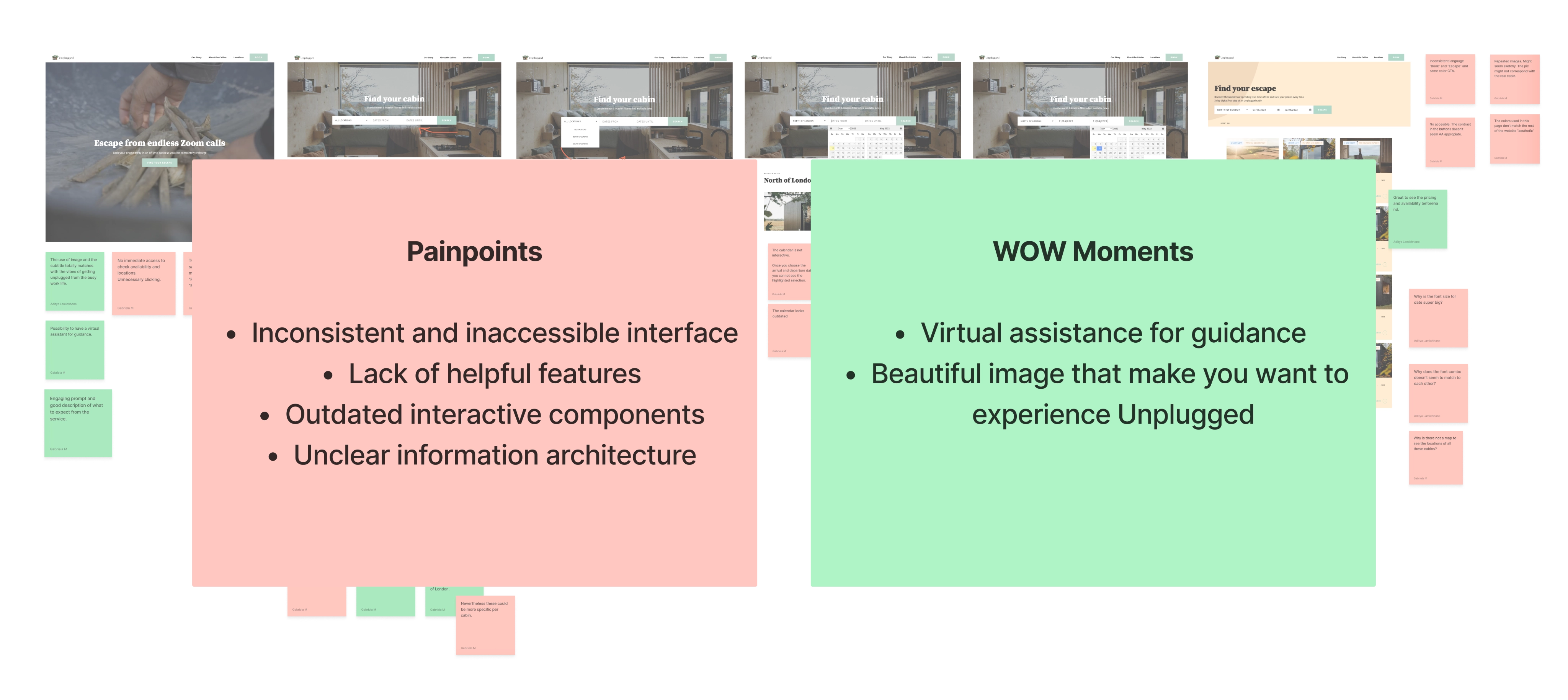
Following the audit, we outlined three starter objectives:
- Create a Cohesive Design System: Prioritize the establishment and upkeep of uniform color palettes, text styles, writing tone, and overall aesthetic coherence across the entire user experience.
- Enhance Accessibility: Develop accessible buttons that meet WCAG standards.
- Refine Existing Features: Implement enhancements to existing features such as the calendar, while also exploring opportunities to integrate new, beneficial features such as mapping capabilities.
Clarifying Discrepancies
Understanding our constraints
Our audit uncertainties surrounding cabin information; such as the number of days a guest can stay, pet policy rules, among others.
Major constraints included:
- Cabin Stay Constraint of 3 Nights (4 Days)
- 2-guest limit per cabin
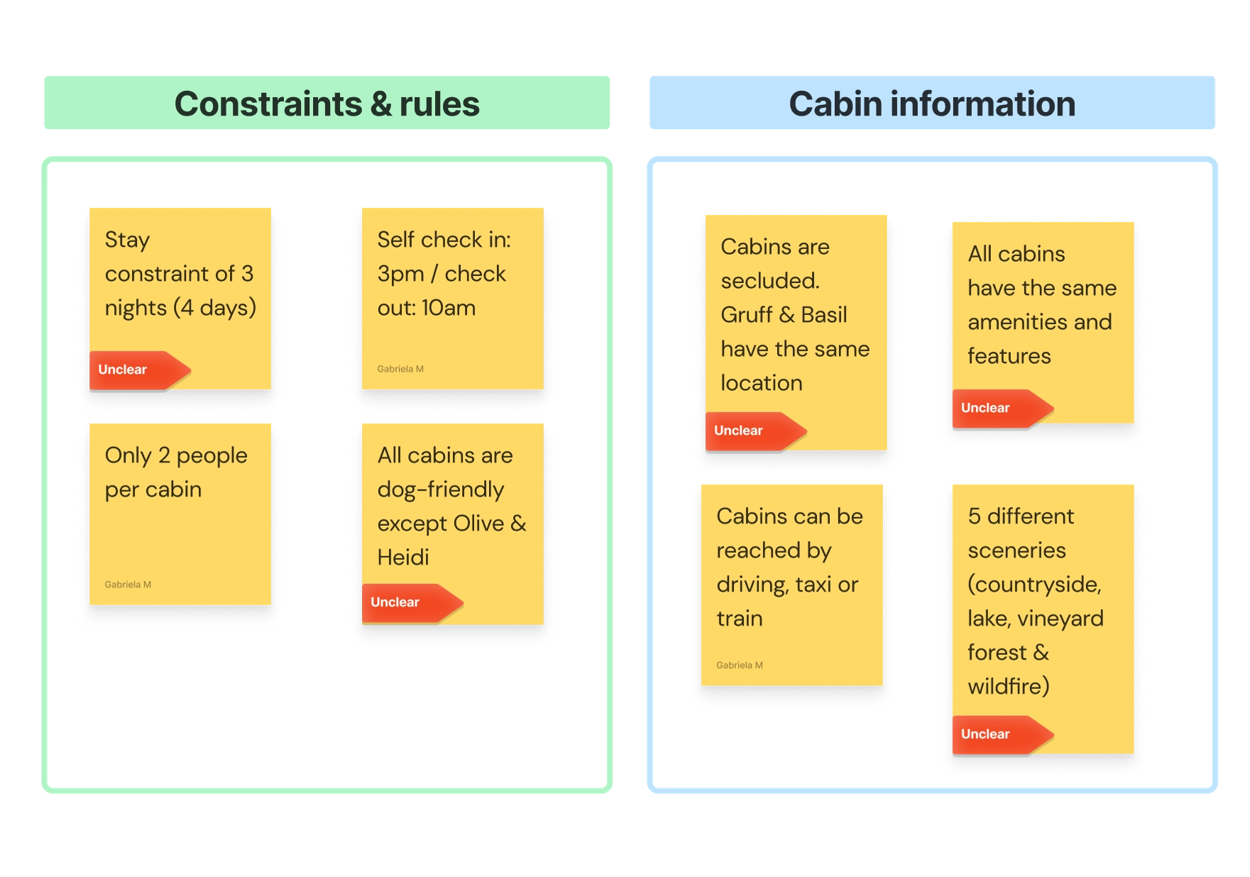
Results on the search of Constraints, Rules and Cabin Information
Competitor Benchmarking & SWOT Analysis
What do other cabin booking websites offer? What makes Unplugged different?
We conducted a competitive benchmarking and a SWOT analysis to gain insights into the features and solutions of our competitors.
The findings were unexpected: while we anticipated more direct competitors for Unplugged,we discovered a significant opportunity within the market. However, to capitalize on this opportunity, Unplugged’s website must align with user's mental models and expectations of a booking site, which we discovered were pretty consistent across most competitors.
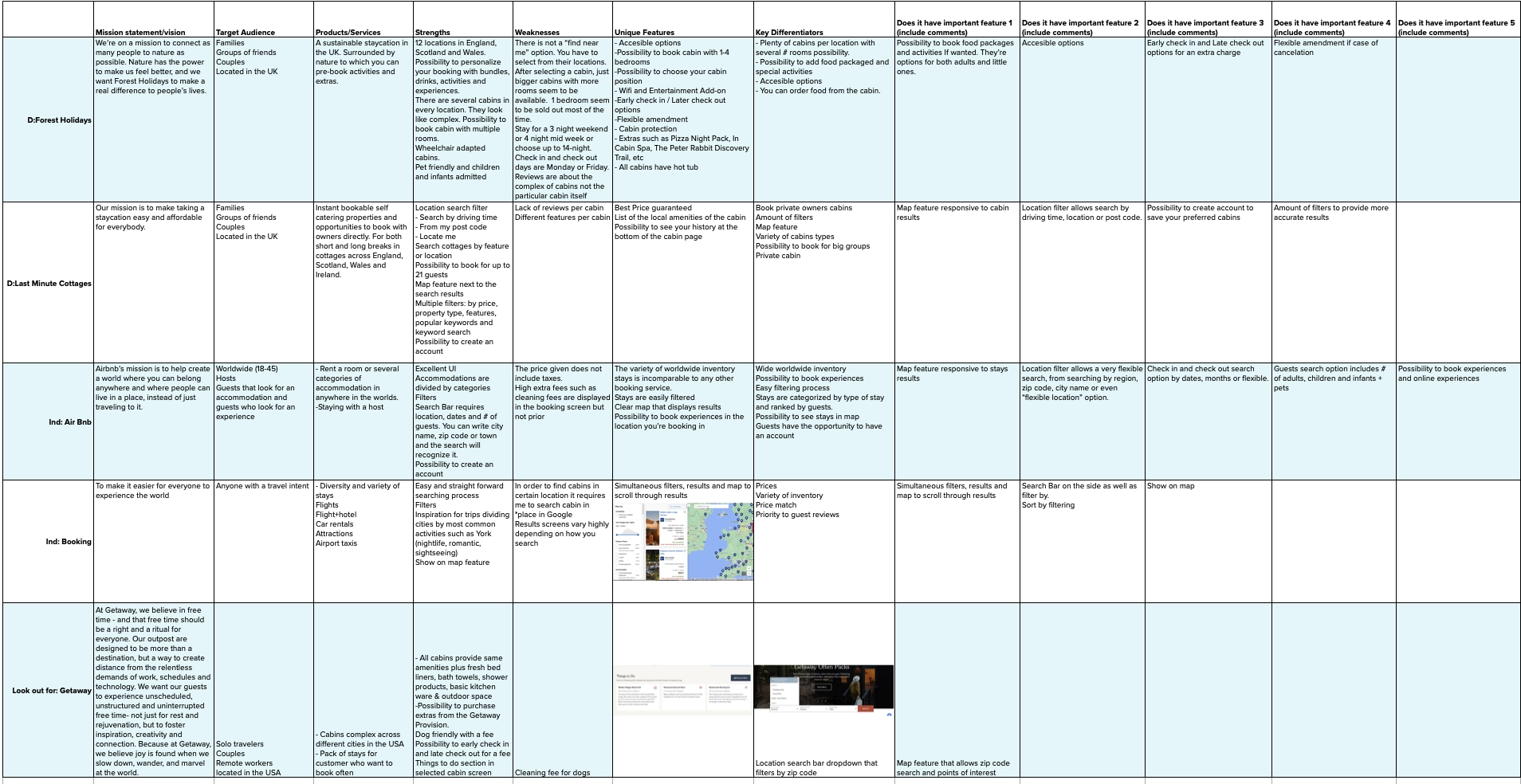
Table comparing popular features of competitors
Differencing Factor
Unplugged provides a digital detox experience apart from just a stay.
Unplugged’s sweet spot on the market
Digital Detox Escape Mental Health Focused Stay + Experience
Industry standards
The industry standards shared by most of the competitors were not being met by Unplugged. These included: filters, sort by options, map features, flexible possibilities, stays categorized by type of accommodation, among others.
define
Primary Research
Who are our users? What are their needs and goals? Which pain-points they experience while booking a cabin?
To better understand our target audience of “busy city workers who needed a break from the city and technology”, we analyzed customer reviews of Unplugged.
Our objectives were the following:
- Assess whether the profile of past visitors align with the characteristics of our target audience.
- Understand the experiences of past visitors
- Pinpoint areas for digital experience improvement
The reviews were very positive. Notably, we discovered that previous visitors closely resembled our target audience, often admitting to being frequent technology users for work and expressing challenges in disconnecting and unwinding. These insights were instrumental in shaping our user persona within our time constraints.
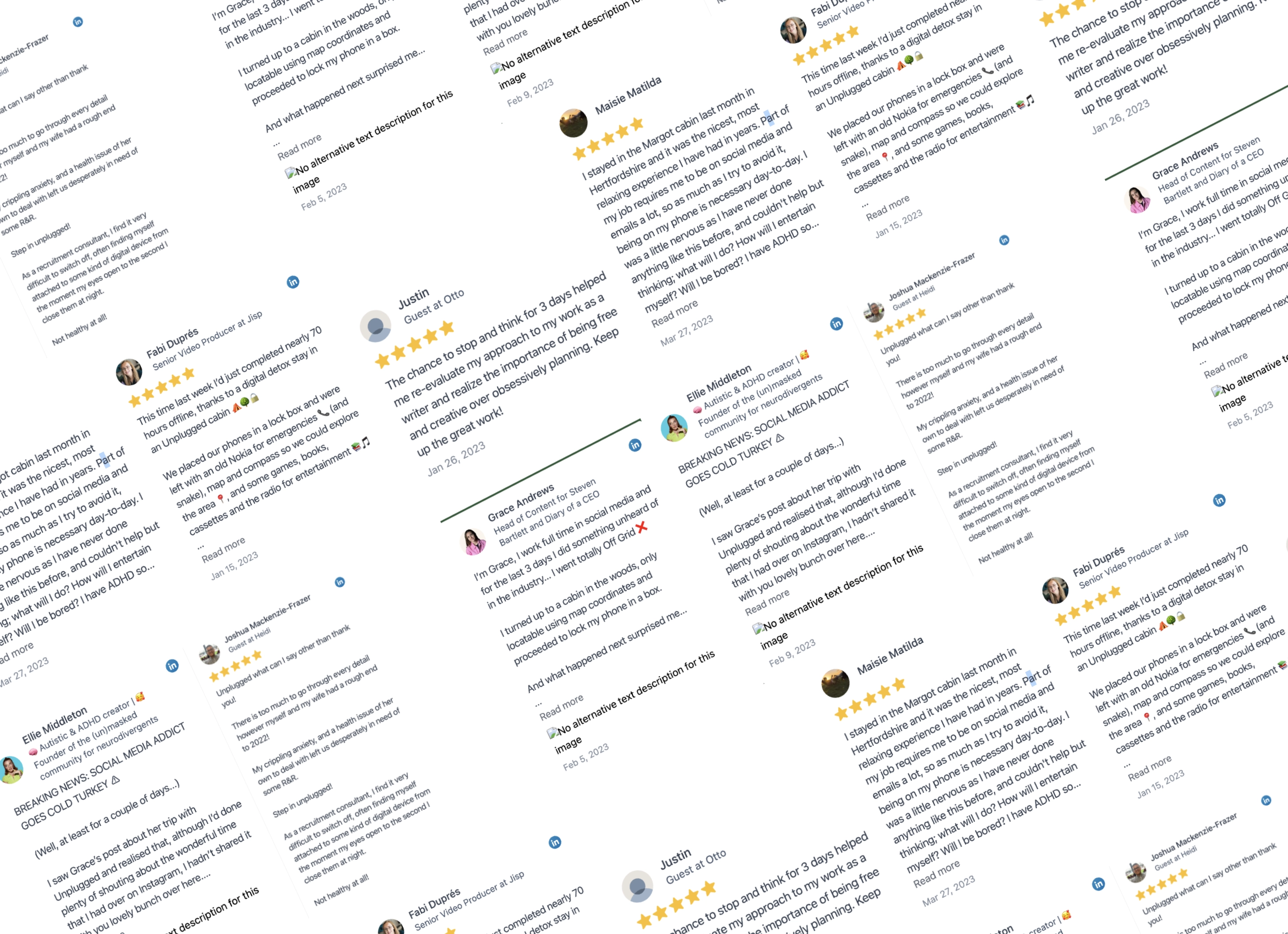
Secondary Research
Survey Insights
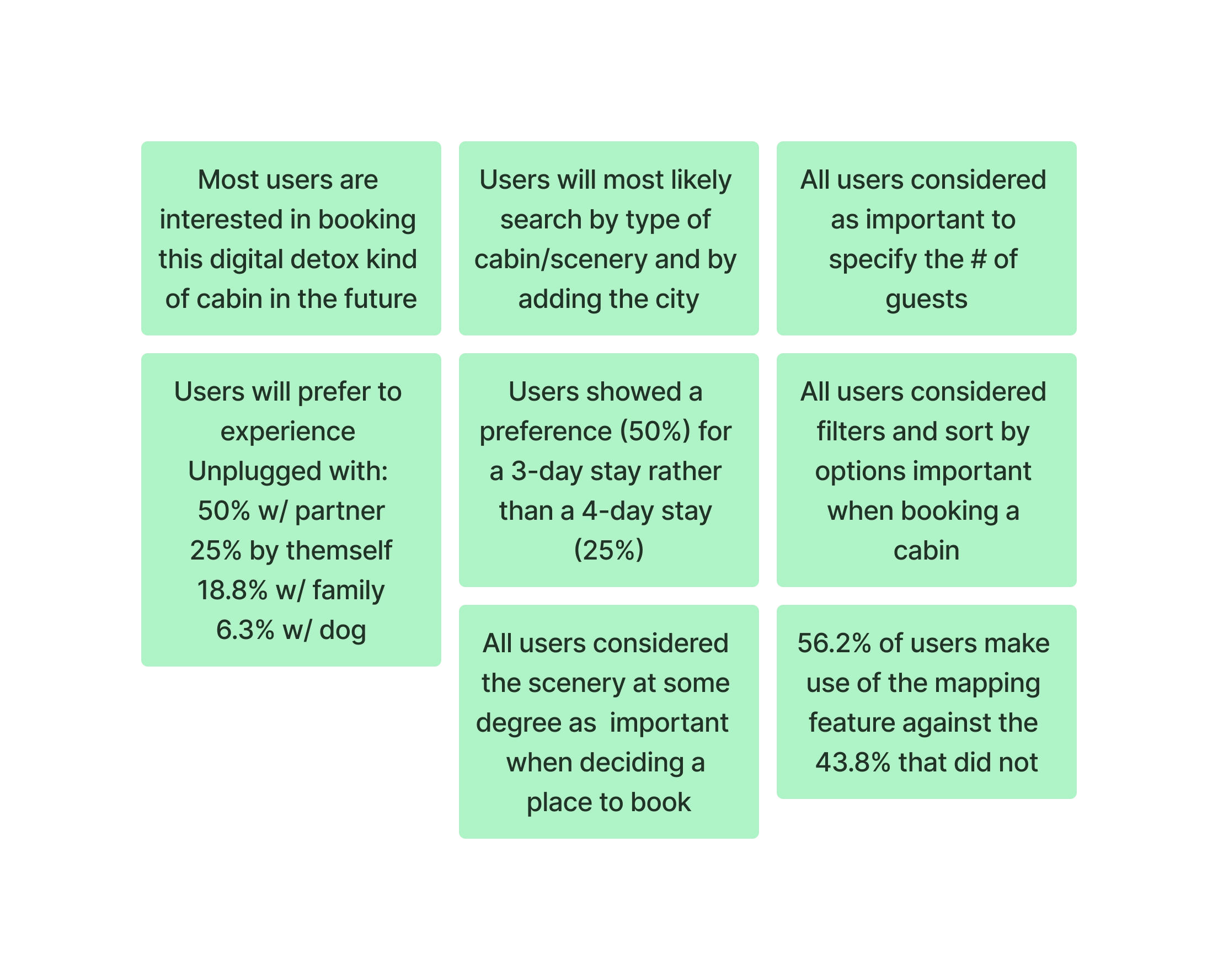
To deepen our understanding of Unplugged's target audience and their challenges when searching and booking a stay, we conducted an online survey utilizing Google Forms. The survey blended both multiple-choice questions for quantitative data and and open-ended questions to capture qualitative insights. Over four days, we distributed the survey within relevant remote worker communities across the UK.
We obtained 16 submissions, representing a demographic range spanning ages 18 to 40. Responses came from various cities across the UK.
Survey Insights
Secondary Research
Categorization of Cabins
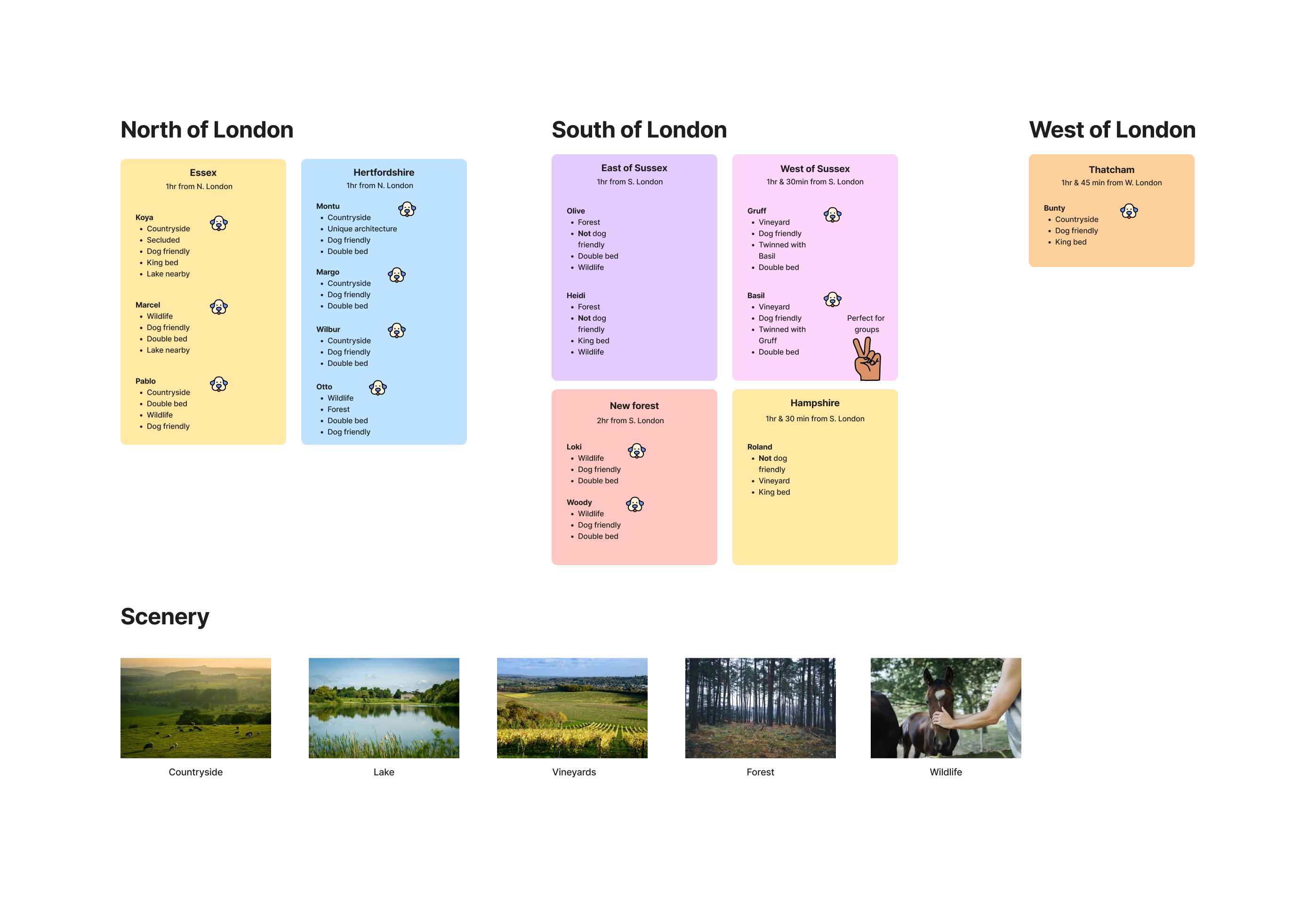
An interesting finding from our survey was that 38.5% of users primarily prioritized the scenery and surroundings when selecting a cabin.
Upon thoroughly analyzing the details of each cabin, we identified recurring patterns that facilitated our filtering process. These key patterns included:
These patterns were:
- Location (City or Zip code)
- Scenery
- Type of bed
- Pet Policy
Categorization of Cabins
DEEPER INSIGHTS: DEFINING SUCCESS
Defining Success
“It seems like users expect a well filtered, easy to use search functionality that leads to quick and accurate results based on their states preferences”
Before we moved forward into designing, it was important to understand what a smooth booking experience would be for those busy city workers. In order to prove success we set up the following metrics.
- Task Success Rate: Is the user able to find a select a cabin that match their preferences?
- Time on Task: How long does it take for the user to find a cabin that match their preferences?
- Customer Satisfaction: How easy is it to book a cabin with Unplugged? Rate it on a scale from “very easy” (1) to “very difficult” (10).
FRAMING THE PROBLEM
Problem Statement
Unplugged.Rest website is outdated and lacks essential features that are expected in the industry. Busy city workers are finding it difficult to effectively search and select their ideal digital detox cabin due to the absence of filtering options, limited availability information, and a lack of standard features commonly found on similar platforms. As a result, user satisfaction is low and we are losing potential booking to more user-friendly competitors.
Persona & User Story
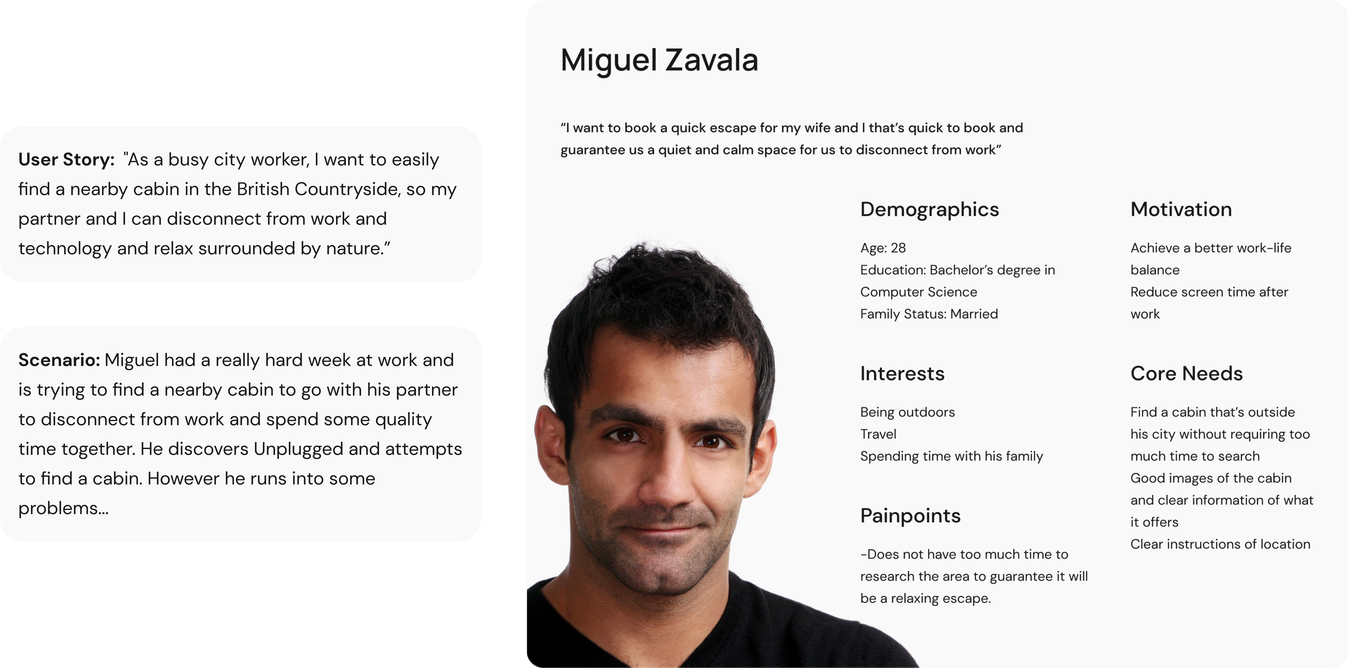
We used the data compiled from my primary and secondary research to create a user persona. This persona reflected the target user for Unplugged. With "Miguel", we hoped to better empathize with the target user throughout the design process. We also created an scenario to represent Miguel pain points throughout the experience.
Friction Analysis
Unveiling Interface-User Friction
We utilized our user persona to help us understand the frictions/pain-points of the Unplugged search, explore and selection journey. This helped us pinpoint key areas of improvement.
Search Stage
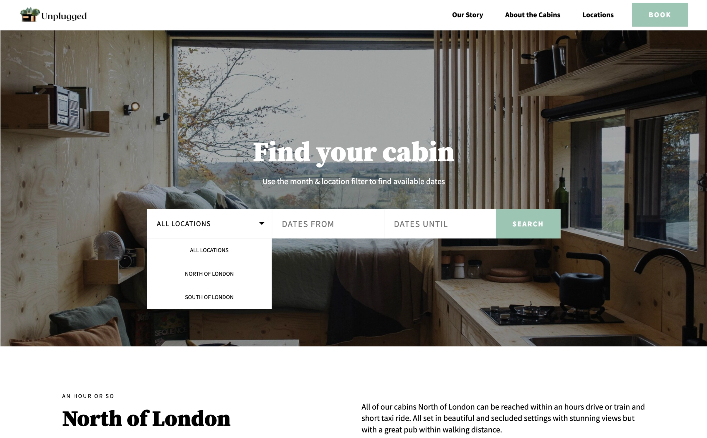
General and Limited Locations
Miguel is restrained to select from very general locations which causes confusion as: what are these cabins exact locations and how far away from him they are.
Search Stage
Lack of # of Guest Filters
Miguel does not have the possibility to specify the amount of guests that will stay in the cabin as there is no # of guest selection dropdown, this causes confusion as he has not been informed how many people can stay in a cabin.
Search Stage
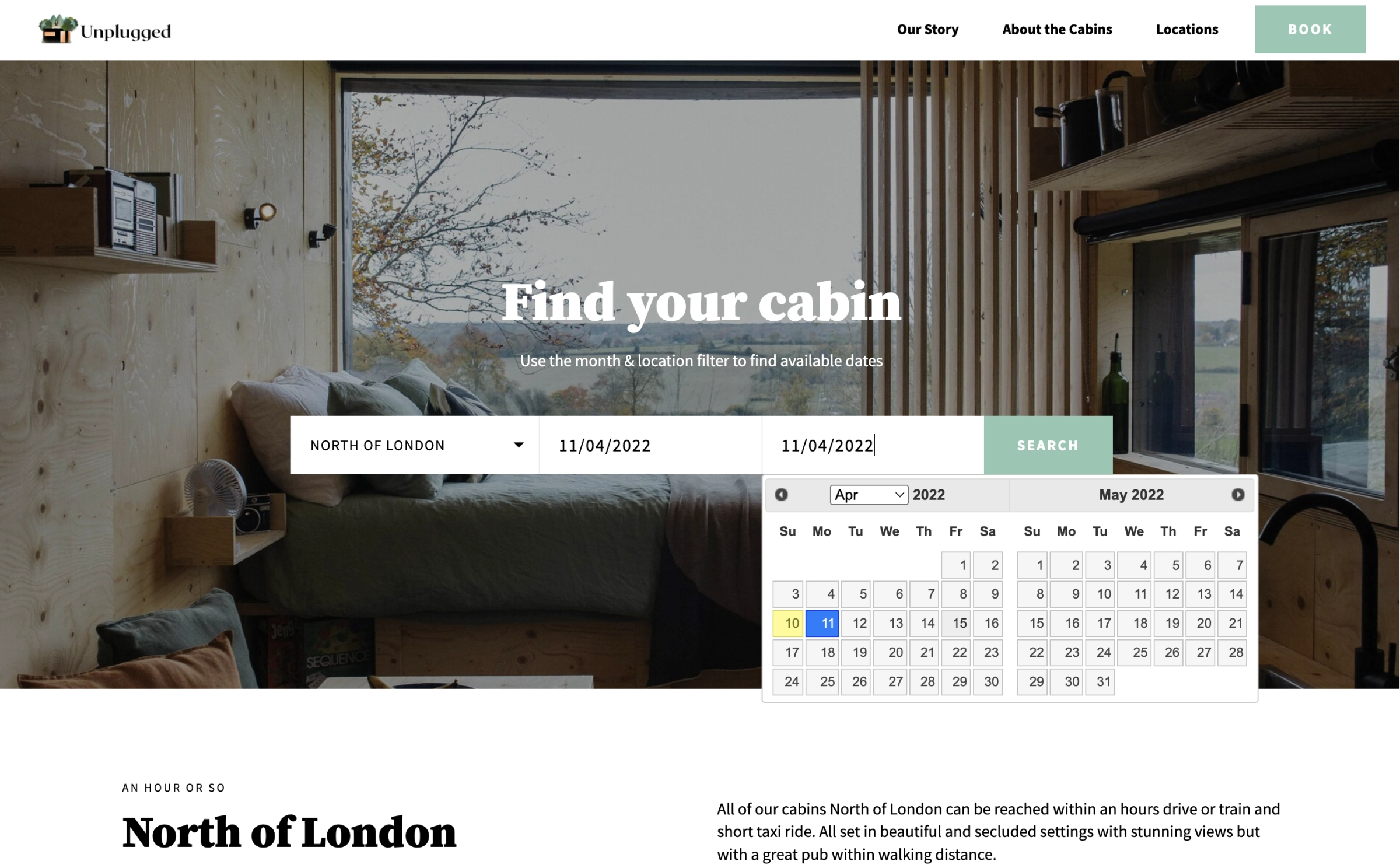
Outdated Check-in/Check-out Calendar
When trying to select the check in and check out dates for his stay, Miguel encounters a non interactive calendar that doesn’t show his selection or the non available days, which causes frustration and discouragement.

Search Stage
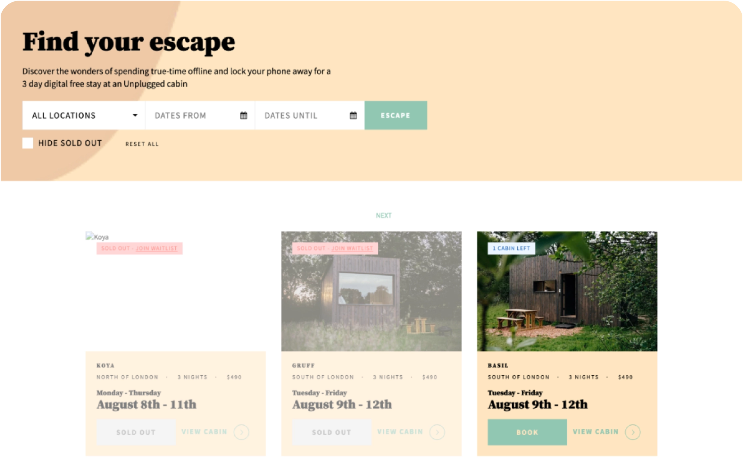
Inexistent Filtering System
Miguel do not have filters or any “sort by” options to filter the results which causes frustration as he will have to do his own filtering by looking at every single cabin which will be more time consuming.
Search Stage
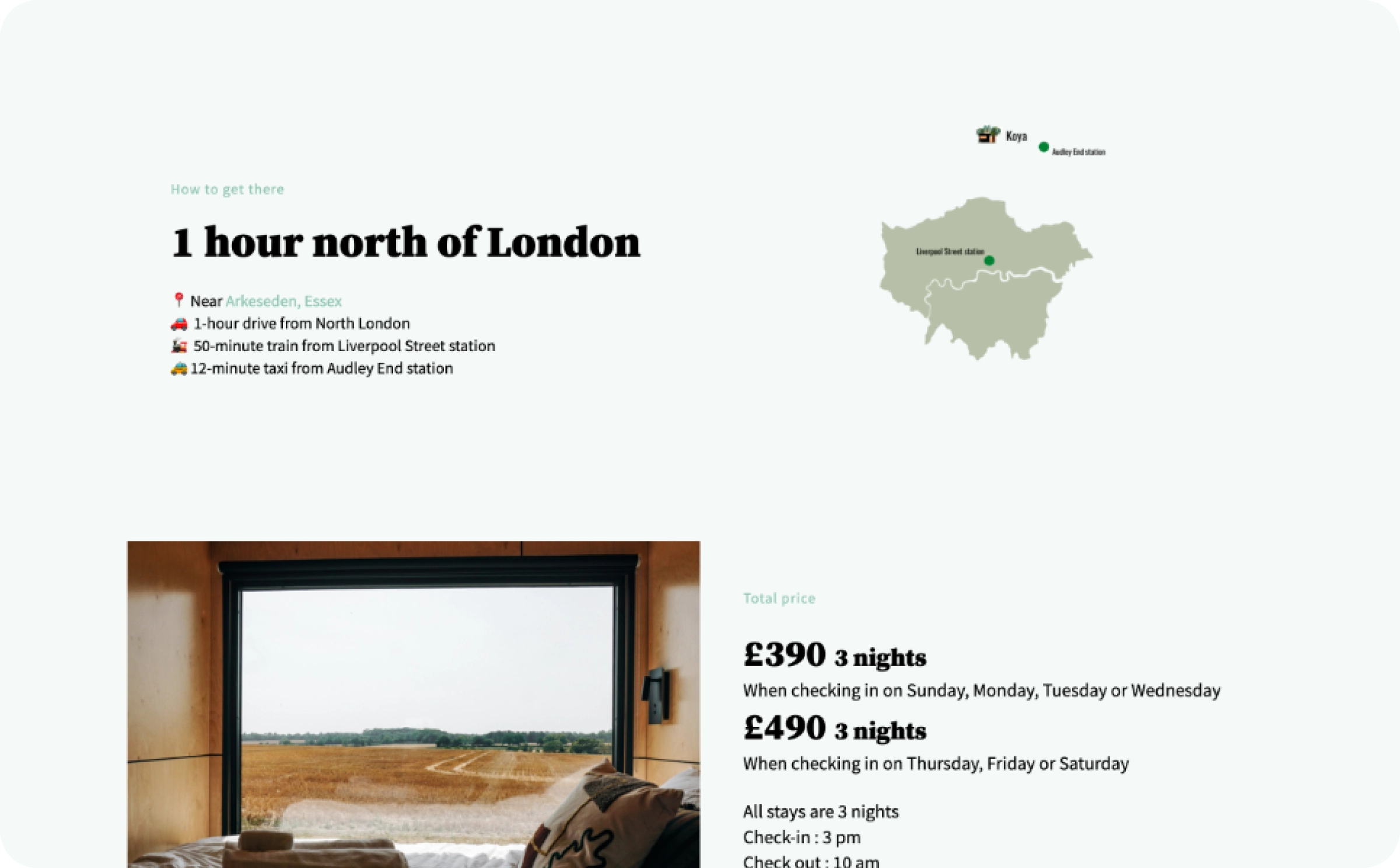
Map Feature
When looking at the cabin results page, there is not a map feature that locate the cabins. Miguel would like to use this feature to obtain a better understanding of the cabin’s exact location and surroundings.
Ideation
Information Architecture
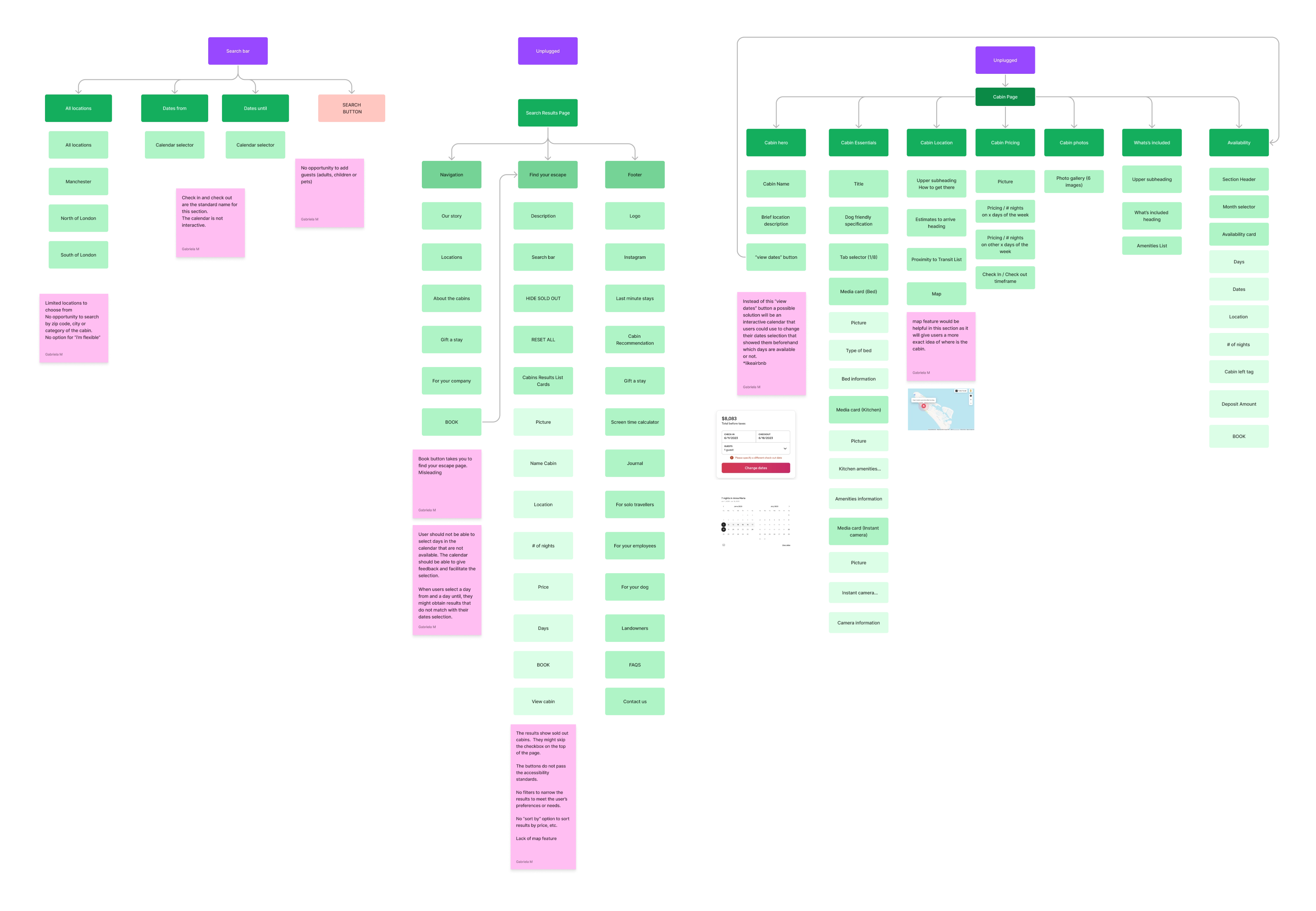
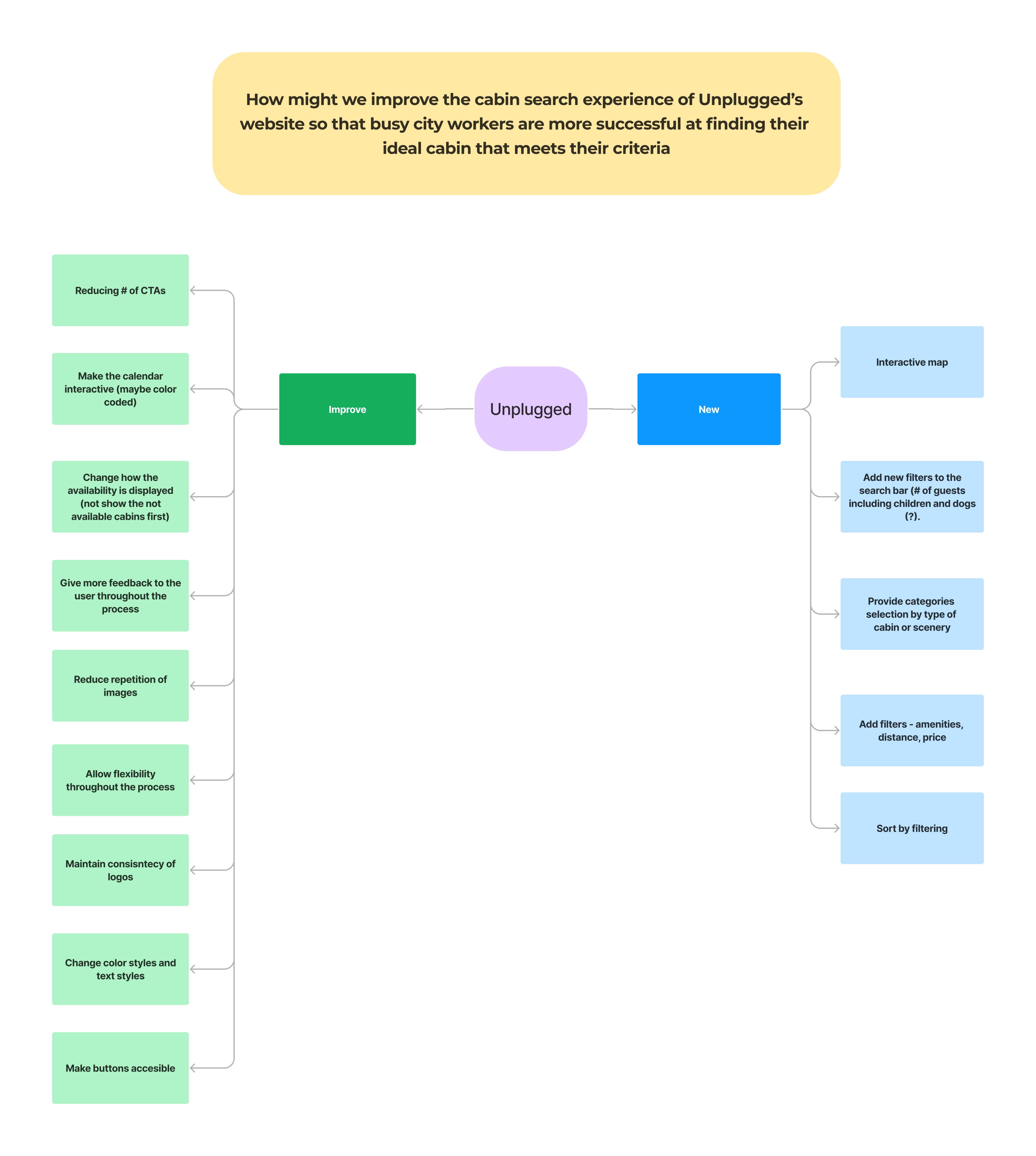
After identifying the problems, we mapped out the existing information architecture of the search function, the results page and the particular cabin page and made notes of possible improvements that will help us map out our solution towards a more clear and organized content, features and functionality.
IDEATING ON THE “HOW”
Ideation
How might we improve the cabin search experience of Unplugged website so that busy city workers are more successful at finding their ideal cabin that meets their criteria?
After identifying the problem , we formulated a HMW question. This allowed us to see the problem as an opportunity and as a start point to ideate on potential solutions.
Hypothesis Statement
"We believe that by implementing modern design enhancements, introducing filtering options, and incorporating standard industry features on Unplugged.Rest, we will significantly enhance the user experience for busy city workers to find their ideal digital detox cabin. As a result, we expect to observe increased user engagement and a greater number of bookings."
FROM DEAD ENDS TO OPTIMIZED
User Flows
Streamlined User Flow
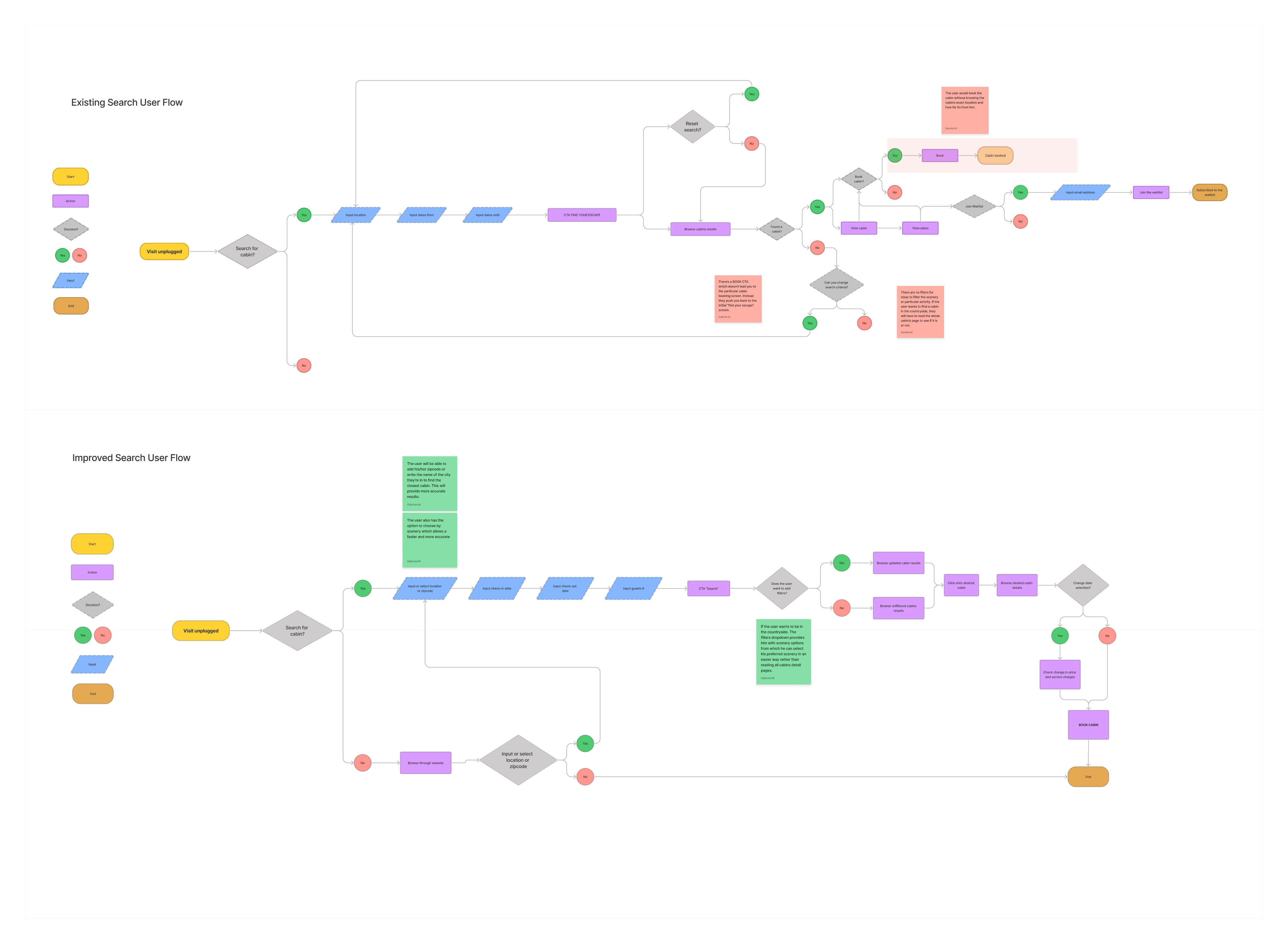
To enhance the search and selection experiences for users, we initiated a process to refine the user flow from search to cabin selection and filtering. We began by evaluating the current flow, identifying dead ends, and addressing them to ensure a smoother journey for users.
Upgrade of search input fields
Now, users can search cabins by location, zip code or preferred scenery, utilize a modern calendar to select stay dates, and specify the number of guests.
Inclusion of Filters
Recognizing the importance of personalization, we incorporated filters to streamline the cabin selection process.
Introducing Scenery-based Search
Drawing insights from user interviews, we discovered that many users have specific preferences regarding scenery. To cater to this, we implemented a scenery-based search feature, allowing users to filter cabins based on their preferred surroundings.
By implementing these enhancements, users can now navigate seamlessly, find cabins that align with their preferences, and make informed decisions with greater ease and efficiency.
Ideation
Streamlined User Flow
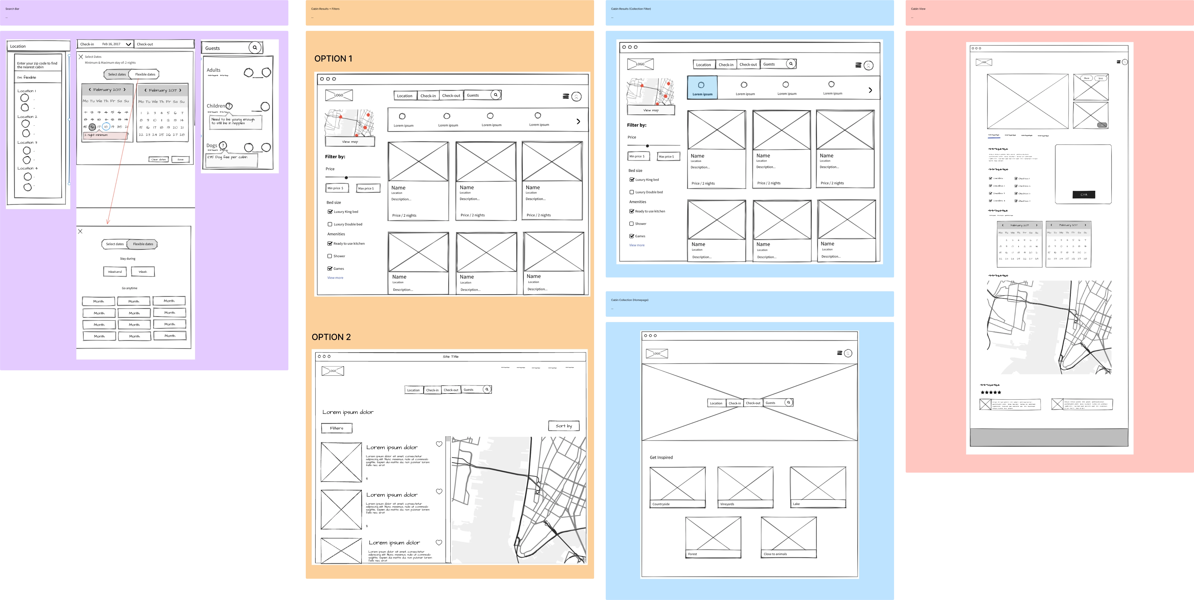
After laying out the improved user flow, I created wireframes for the search, explore and select screens. We experimented and iterated quickly to establish the app's basic layout and structure before we continue with the design.
By implementing these enhancements, users can now navigate seamlessly, find cabins that align with their preferences, and make informed decisions with greater ease and efficiency.
Design Solutions
Before and After
Optimize Information Architecture & Enhance Key Features
We added an interactive gallery of images, accompanied by informative tags. Cleared the information architecture of each experience, this information was structured intensionally to provide all the details needed for the users to enjoy the attraction easily and smoothly. We also increase the size of the map feature to facilitate exploration and added a “nearby experiences” section to invite users to continue their journey with NYCBP.
Before
After
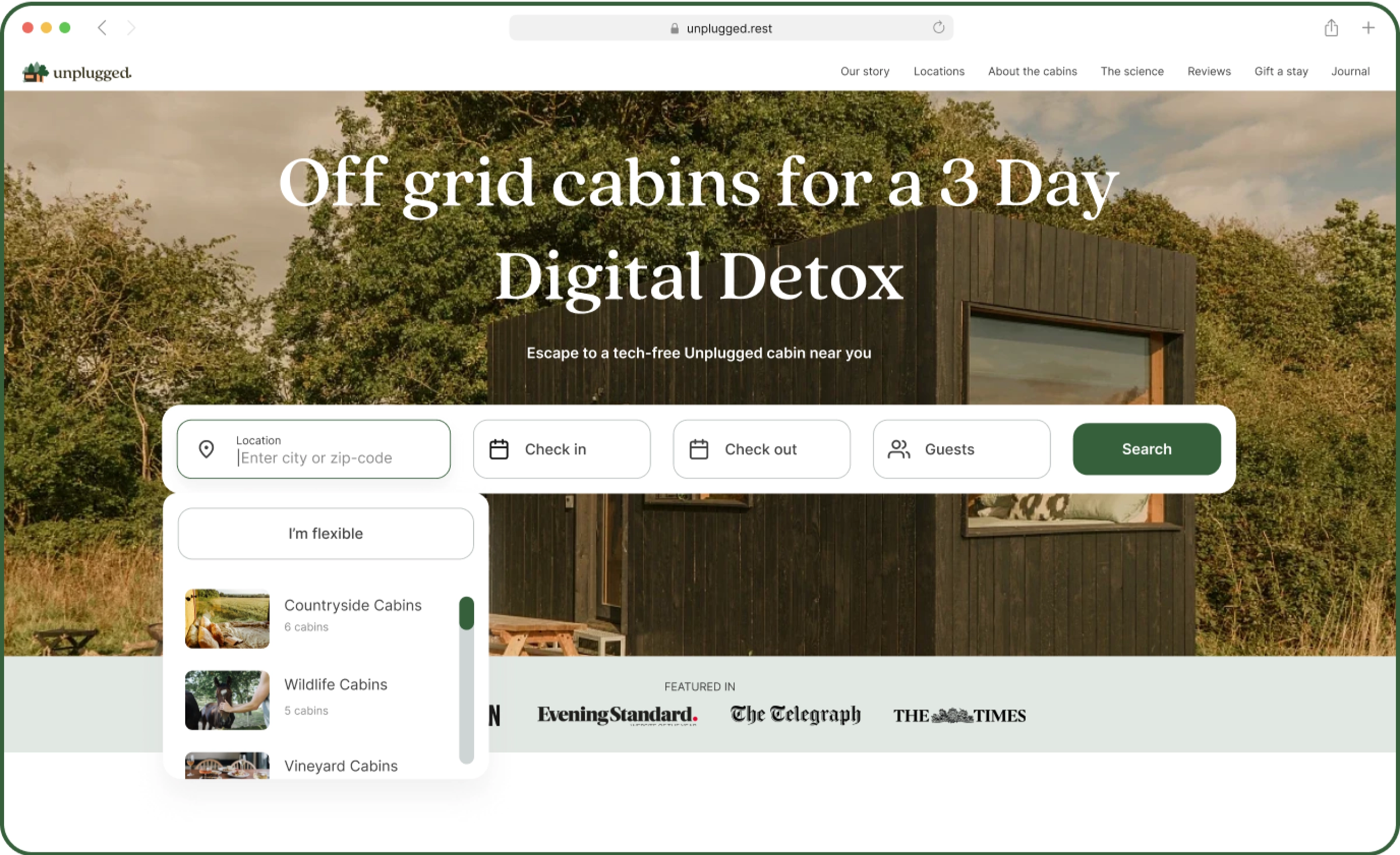
Updated Checkin/Checkout Calendar & Addition of # Guests
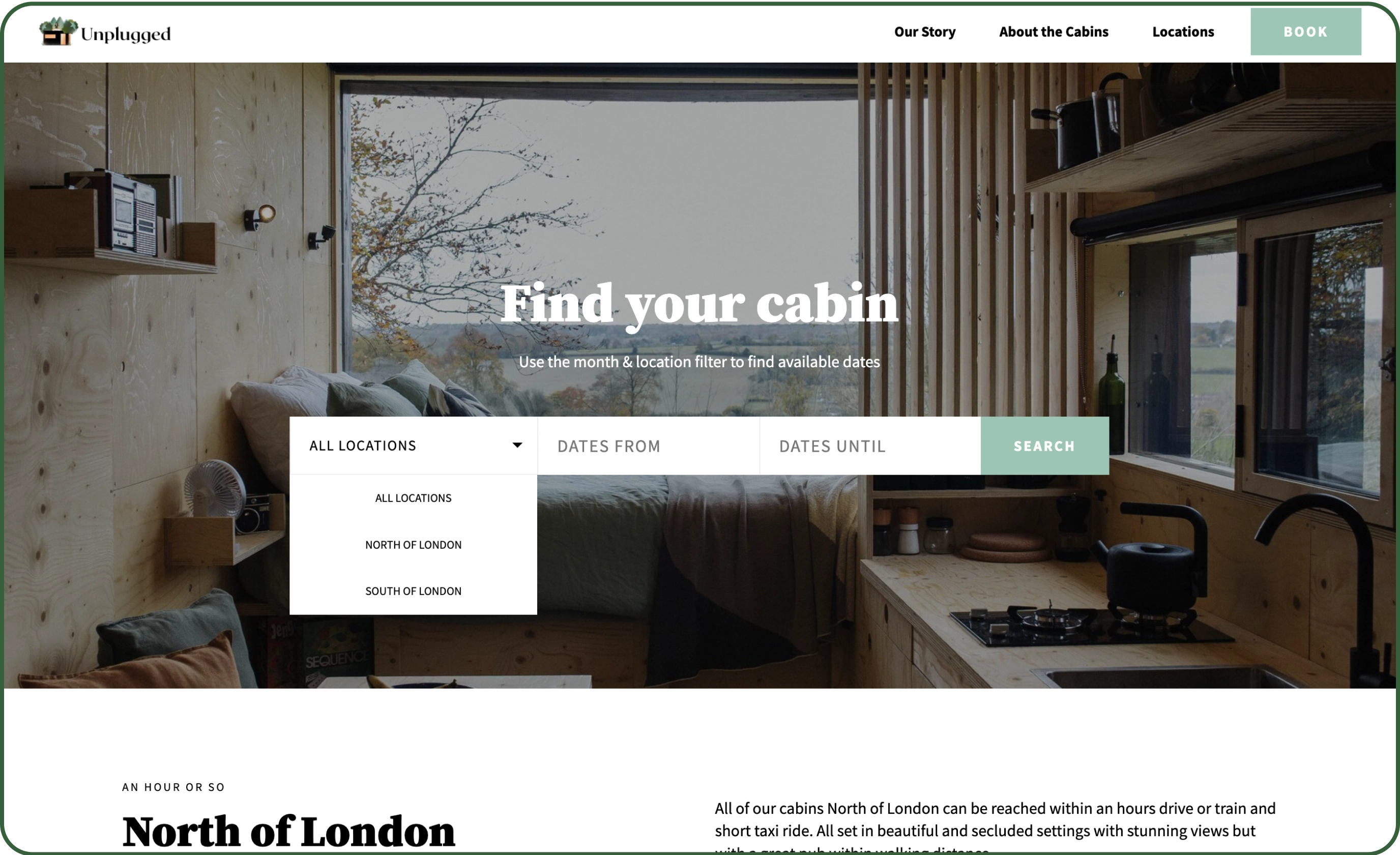
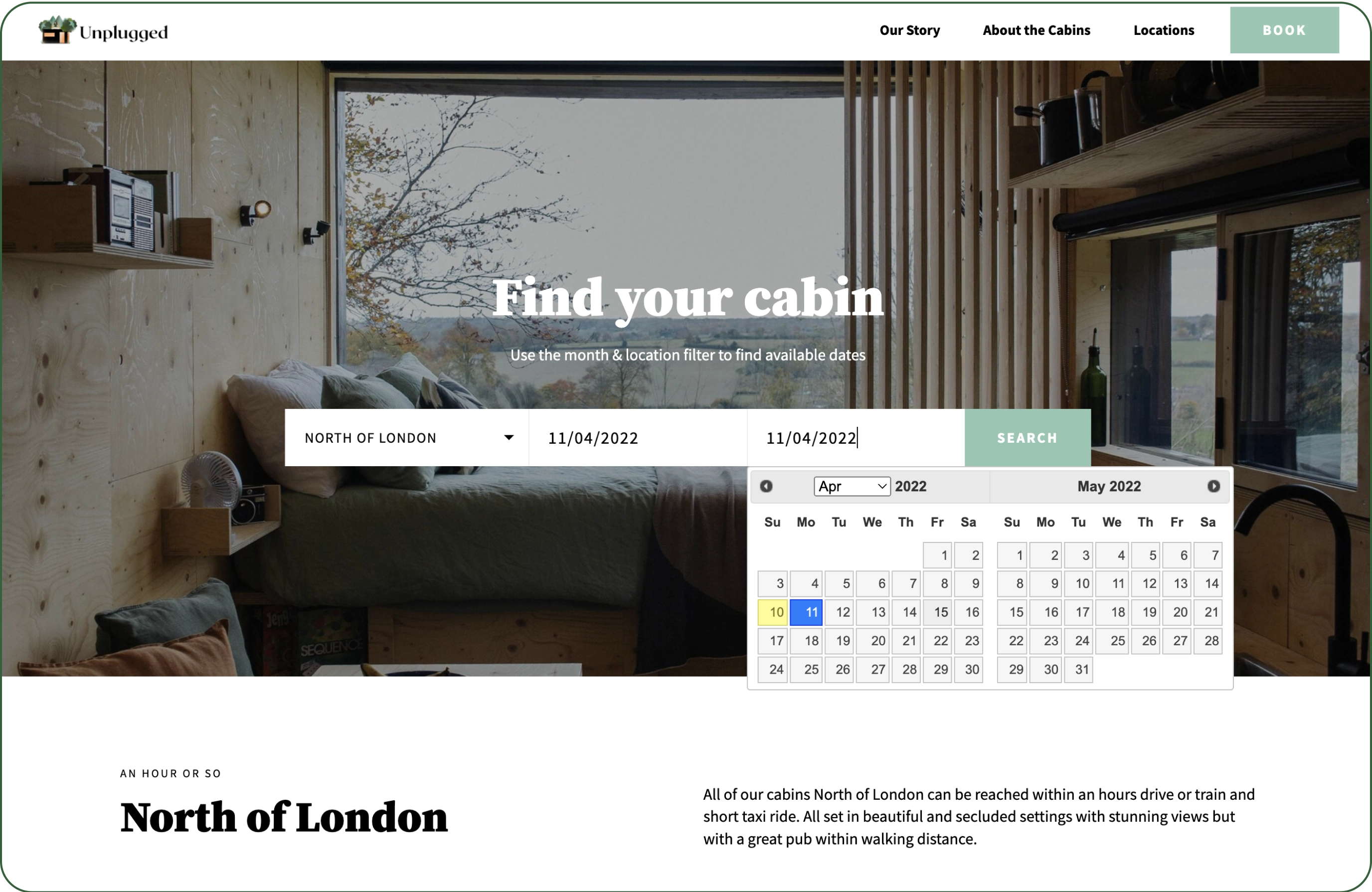
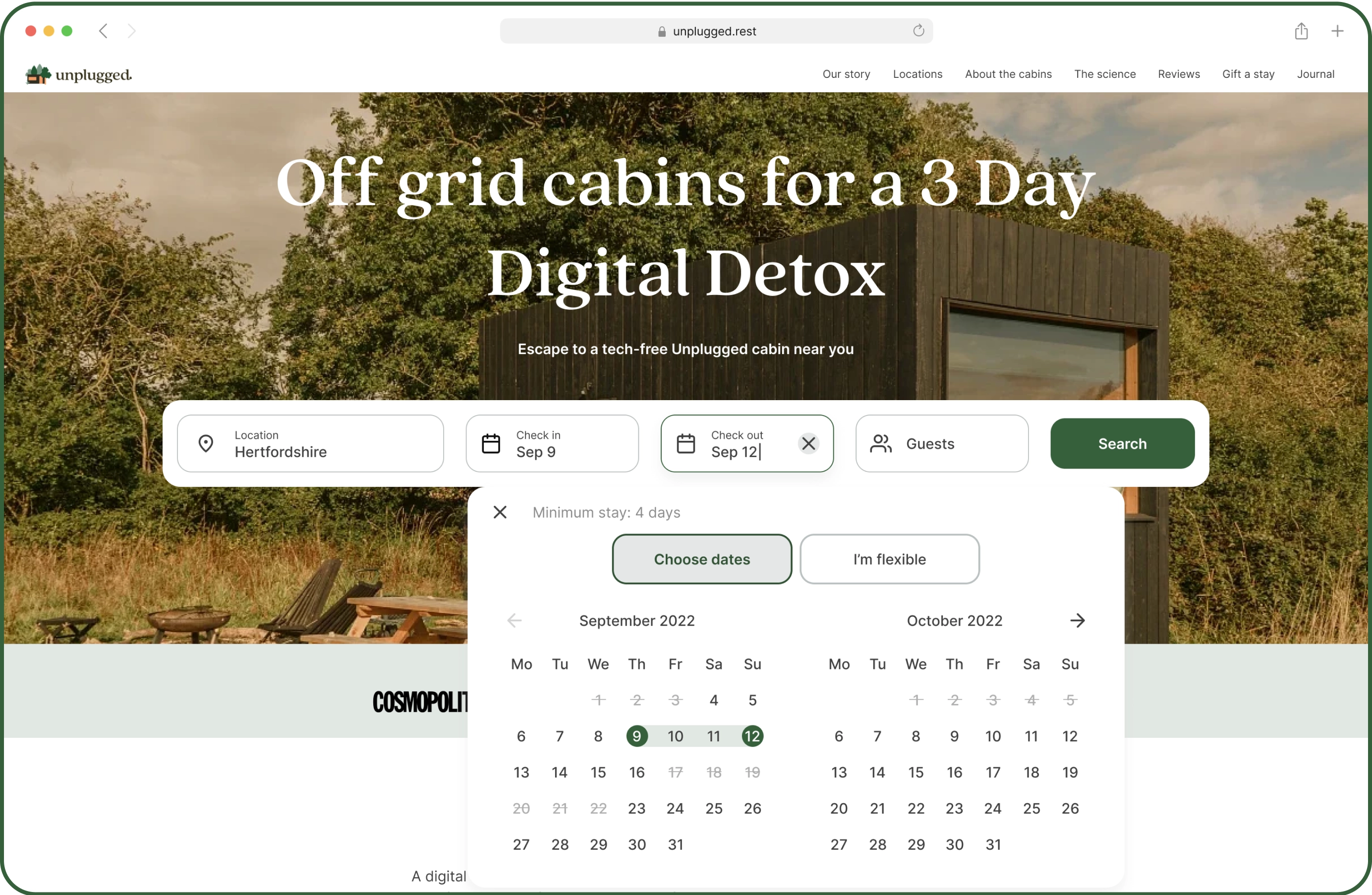
We've updated the calendar to be interactive, renaming 'dates from and dates until' to 'check in & check out' to align with industry standards. We've also added an 'I'm flexible' option. Our survey revealed users prefer shorter stays, so we clarified the 4-day stay constraint to prevent confusion. Additionally, we now differentiate between available and unavailable dates for Unplugged cabins to streamline the booking process and prevent users from navigating to pages with only sold-out cabins.
Through testing and feedback, we also found users want to specify guests and bring pets when booking cabins. So, we've added a guest filter to our search bar. Now, users like Miguel can easily set their preferences, including the number of guests and pet policies, without research.
Before
After
Explore - Filters
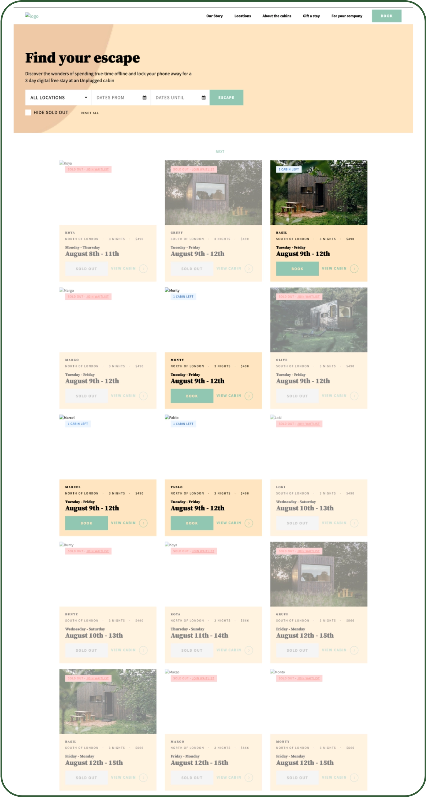
We incorporated a filtering system to the cabins results page, this will facilitate Miguel's search for his ideal cabin as he will able to filter by scenery and bed type as well as sort by price or distance.
Upgrade of Search Input Fields
Now, users can search cabins by location, zip code or preferred scenery, utilize a modern calendar to select stay dates, and specify the number of guests.
Inclusion of Filters
Recognizing the importance of personalization, we incorporated filters to streamline the cabin selection process.
Introducing Scenery-based Search
Drawing insights from user interviews, we discovered that many users have specific preferences regarding scenery. To cater to this, we implemented a scenery-based search feature, allowing users to filter cabins based on their preferred surroundings.
Before
After
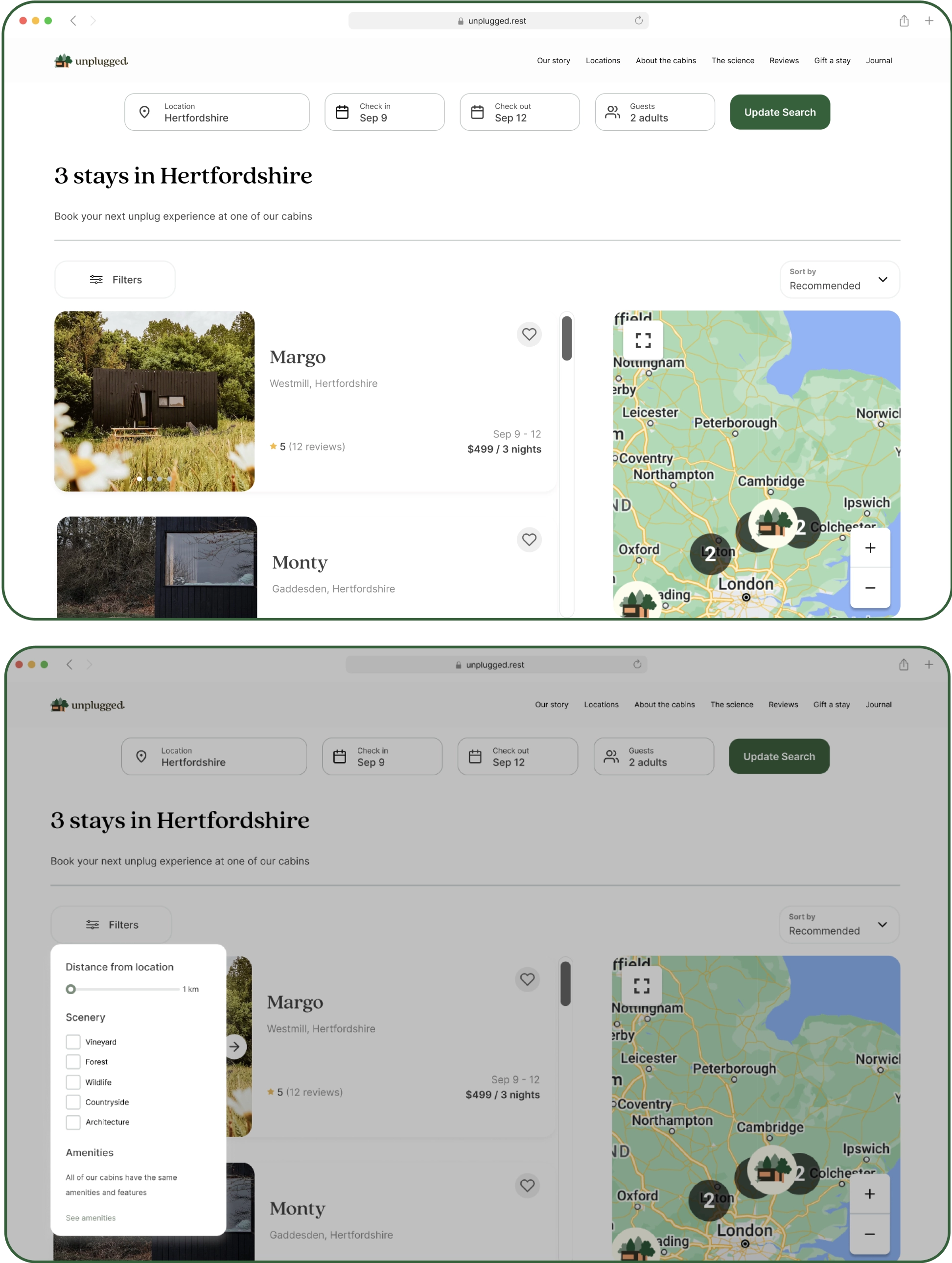
PROTOTYPE
Test task: Book an Unplugged cabin near your city Hertfordshire.
Task scenario: You’re planning a digital detox retreat with your spouse near your city Hertfordshire. You’re planning to stay from Sep 9 to the 12th. You will like to know where exactly the cabin is and what are its surroundings as you will enjoy being surrounded by the countryside. Identify a cabin that meets your needs.
The end
Learnings
This was my second case study with Memorisely and was focused on designing a web-first solution for Unplugged. I extended my knowledge regarding design systems, responsive design and learned new techniques such as the SWOT analysis and the customer journey mapping.
If I had more time, I would have liked to have more time to conduct a usability testing of the prototype to obtain the data regarding our previously set success metrics.
- Task Success Rate: Is the user able to find a select a cabin that match their preferences?
- Time on Task: How long does it take for the user to find a cabin that match their preferences?
- Customer Satisfaction